Lab 1
Exploring geo-embeddings in the real world
Vitaly Kryukov, Newcastle University
We have more data than ever!
Mo Data, Mo Problems?
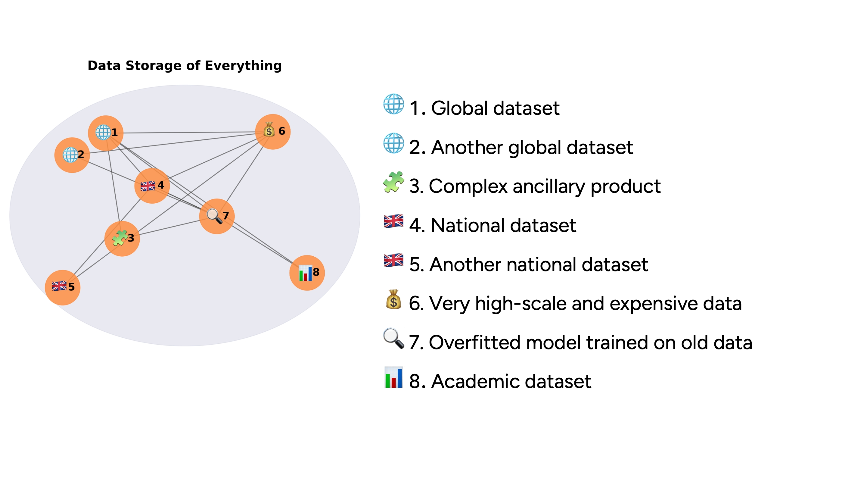
Google Earth Engine
https://developers.google.com/earth-engine/datasets/catalog/GOOGLE_SATELLITE_EMBEDDING_V1_ANNUAL
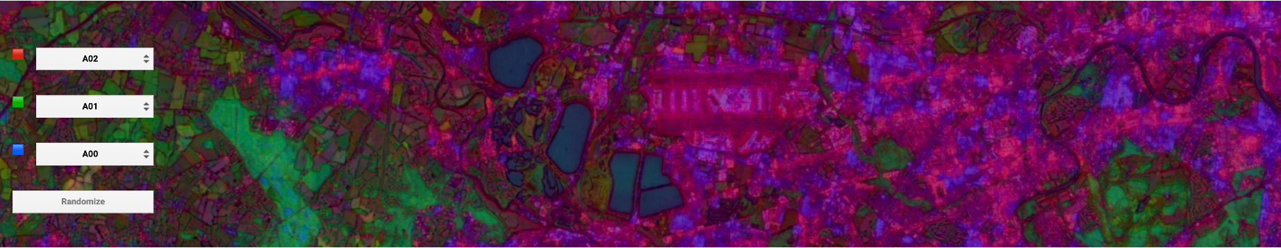
RGB for bands 1,2,3
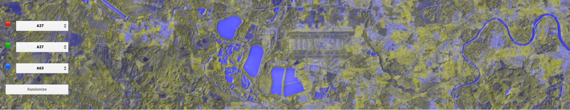
RGB for random bands
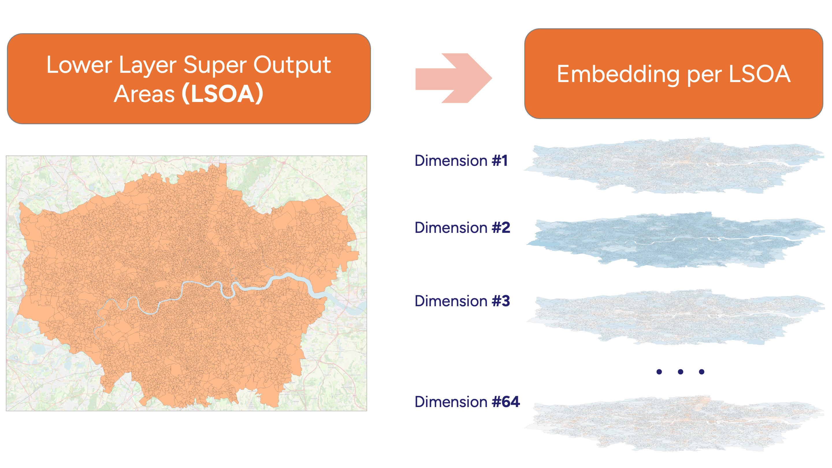
Multiple dimensions
Dimensions are interlinked and create a ‘semantical map’ altogether,
but even a few may tell a story…
IMAGO pipeline
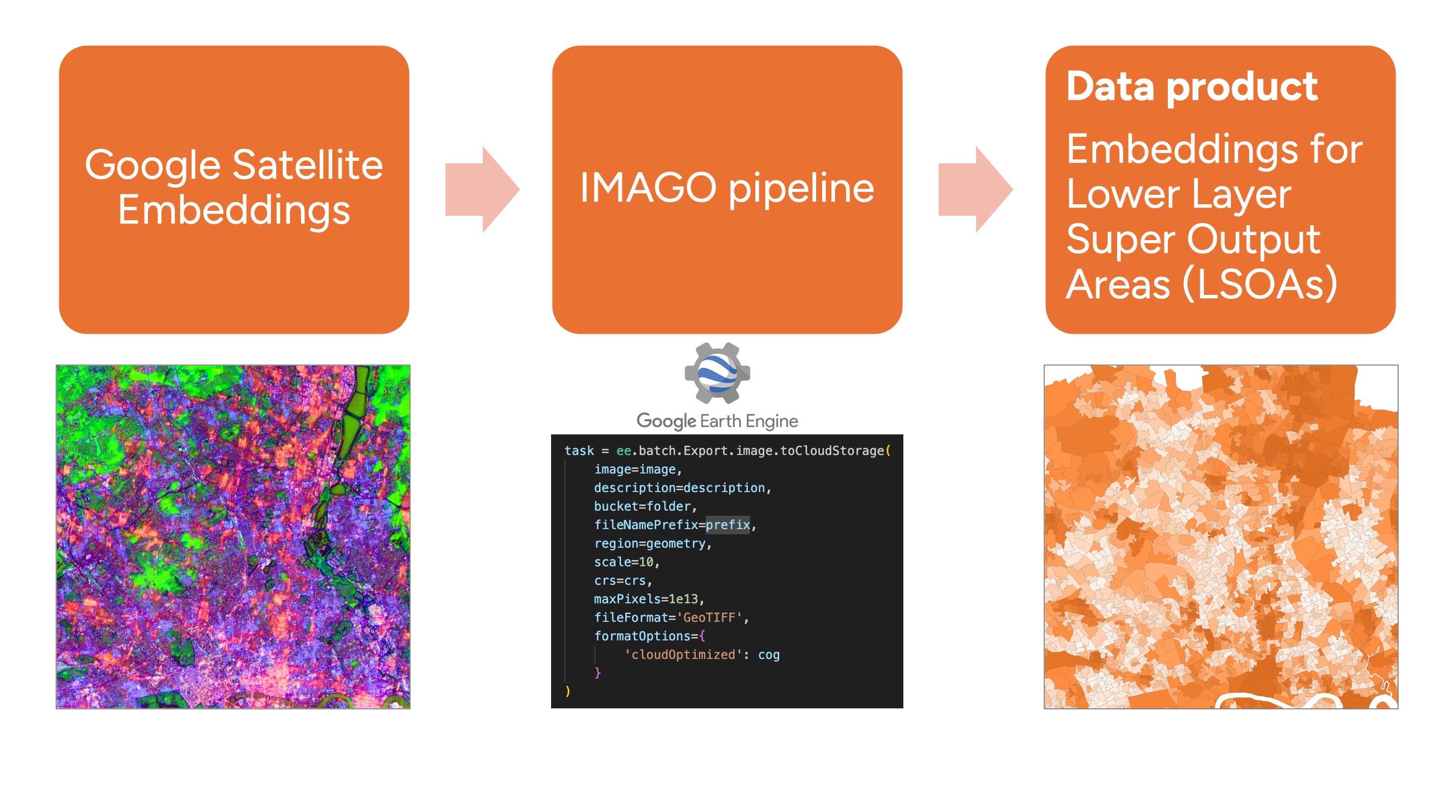
IMAGO data product
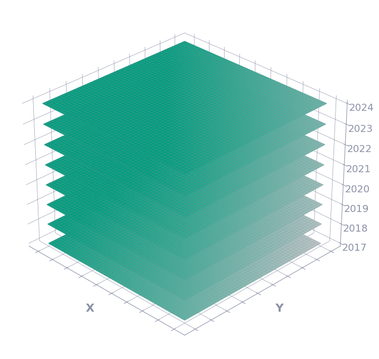
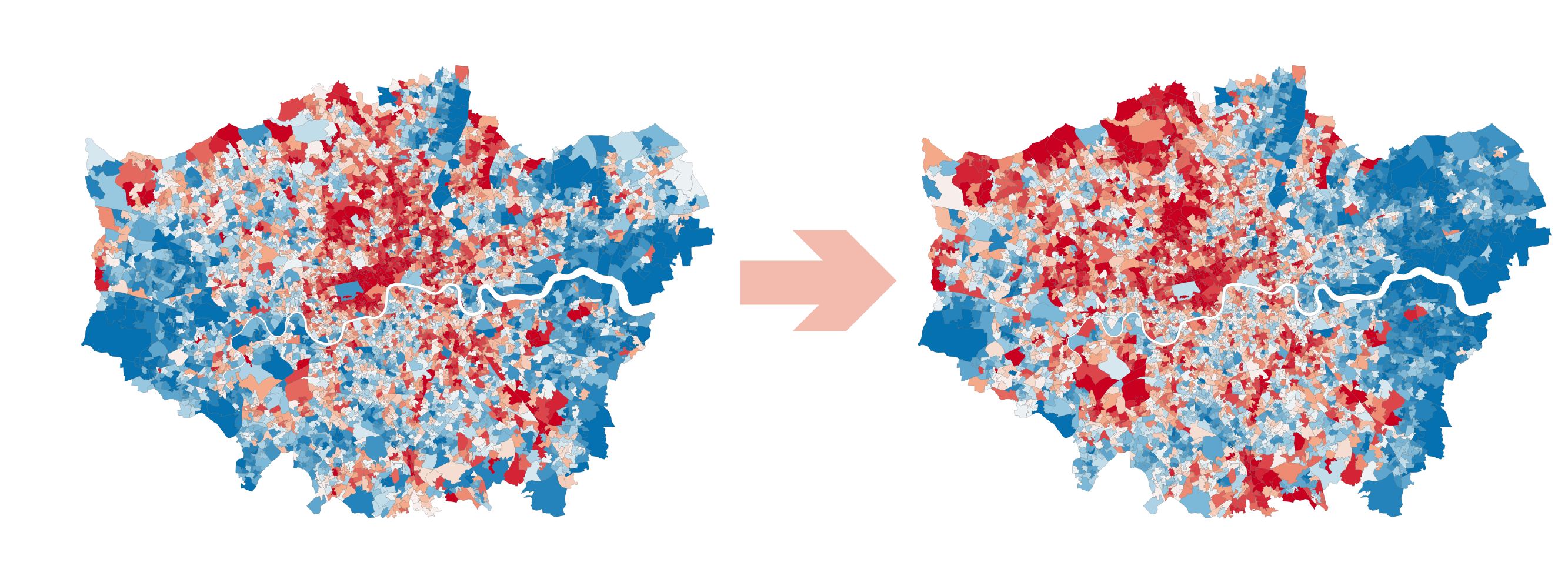
Annual changes
65th dimension
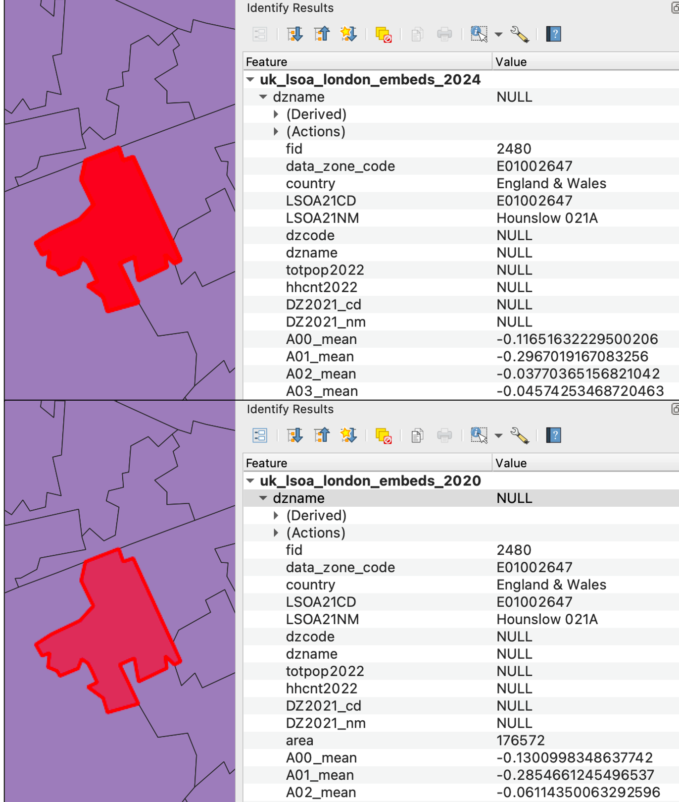
Exercise 1. LSOA exploration
Imago Data Product: https://data.imago.ac.uk/datasets/google-satellite-embedding-v1-london-lsoas-2020-2024
Steps
- Download two GeoPackage files (2020 and 2024), open 2024
- Explore
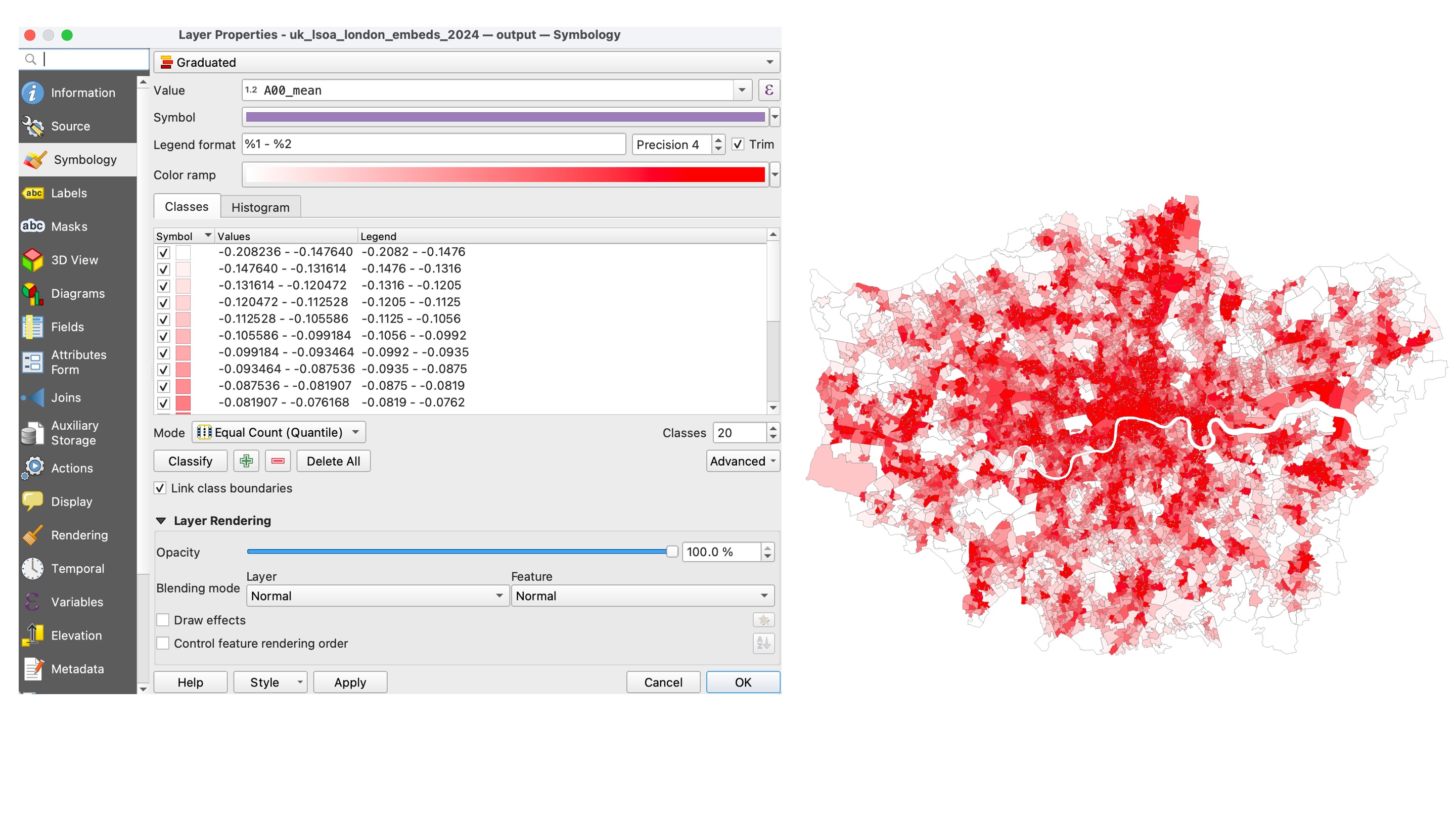
Layer Properties– CRS, format, fields, field types
- Create a layer style to illustrate the spatial differences for the
A00_meancolumn:
Symbology → Layer Properties → Graduated → Default mode → 20 classes → Histogram
- Repeat for the second and third bands (
A01_meanandA02_mean) - Do you see any visual difference?
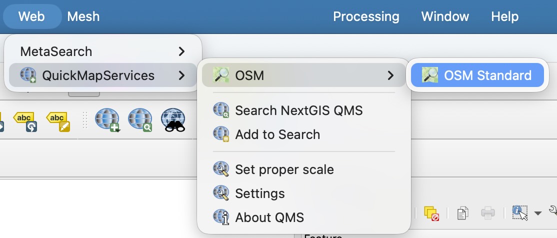
- Visualise layer with 50% transparency over OSM or Google Satellite background. To find the background, use the
QuickMapServicesplugin
- Compare visually the values in the first three columns for 2020 and 2024:
A00_mean,A01_mean,A02_mean.
Do they differ a lot?
- Let’s move to numbers!
Use Processing Toolbox → Vector general → Join attributes by field value
Join
2020layer to2024Define joined field prefix -
2020_
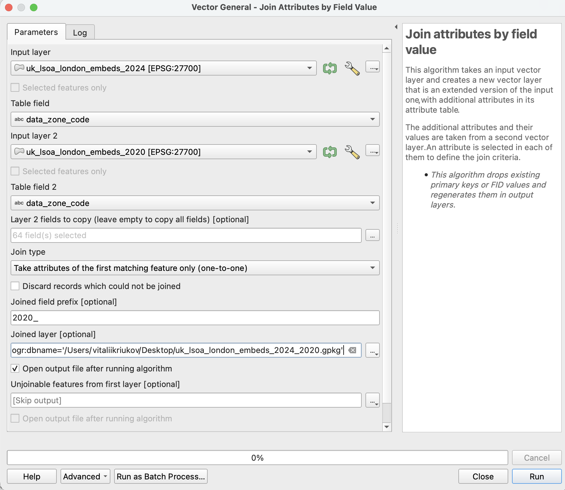
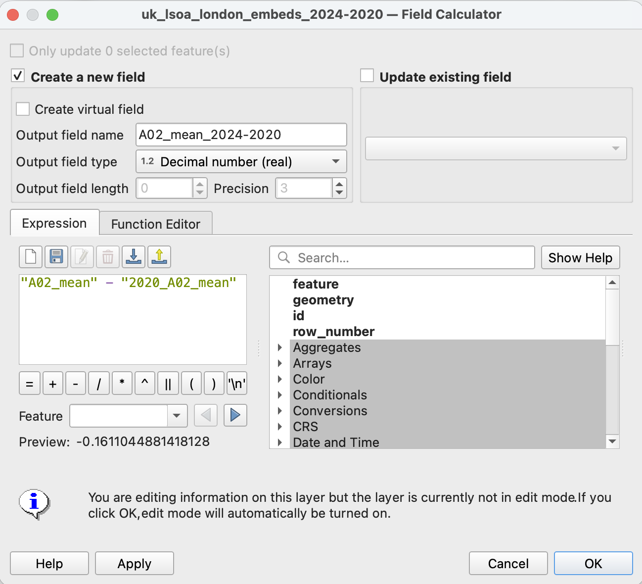
- In the output dataset:
- open Field Calculator
- calculate the difference between 2024 and 2020 for the
A02_meandimension:
“A02_mean” - “2020_A02_mean” - choose output field type:
Decimal number (real)
- Let’s visualise:
- Layer Properties → Symbology → Graduated
- In
valuefield choose the last column
- Colour ramp ->
RdBu - Mode -> Equal interval
- Symmetric classification -> Around 0
- Classes - 10
- Classify
- Check out
histogram
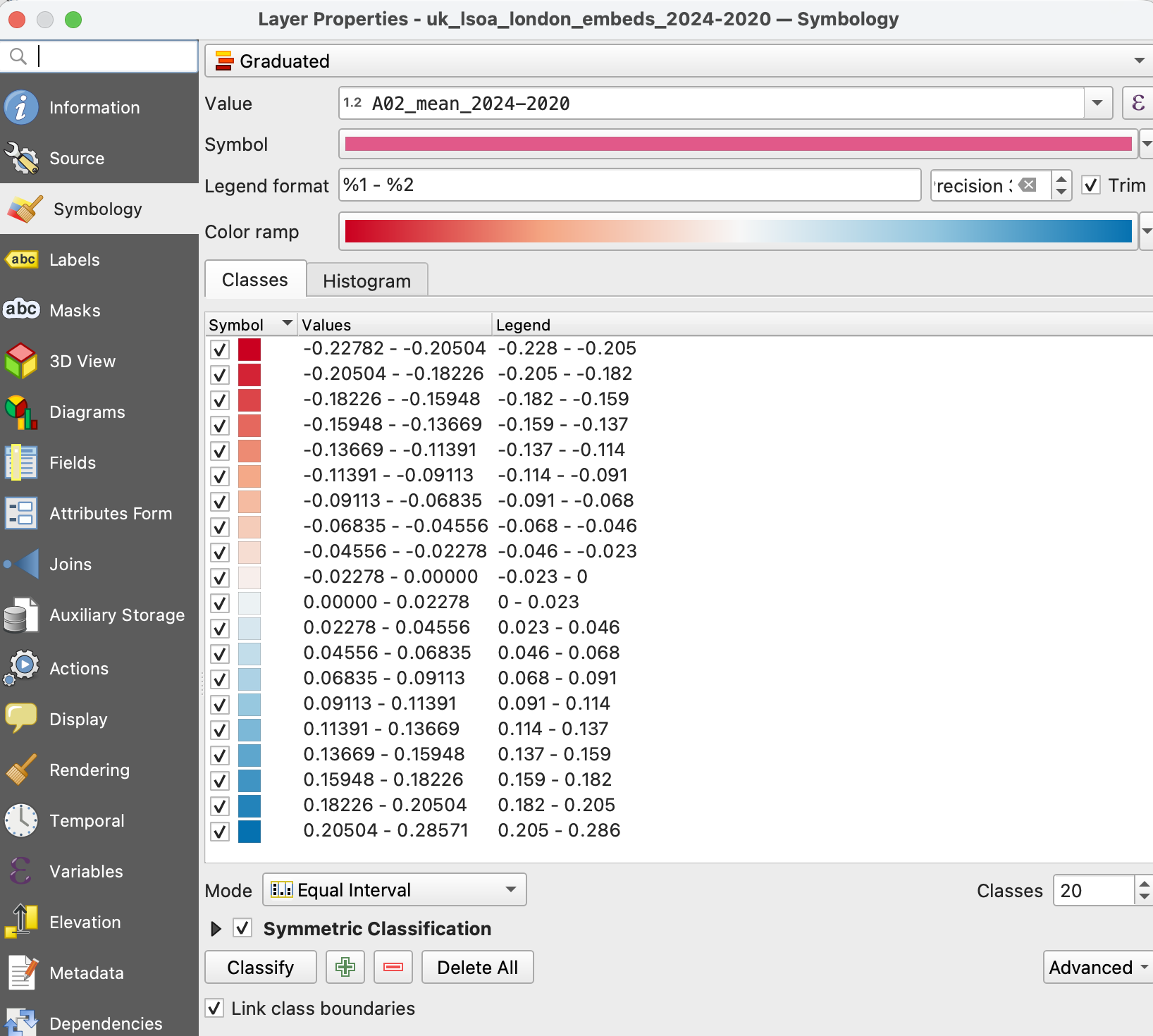
- Do you see any trends in London?
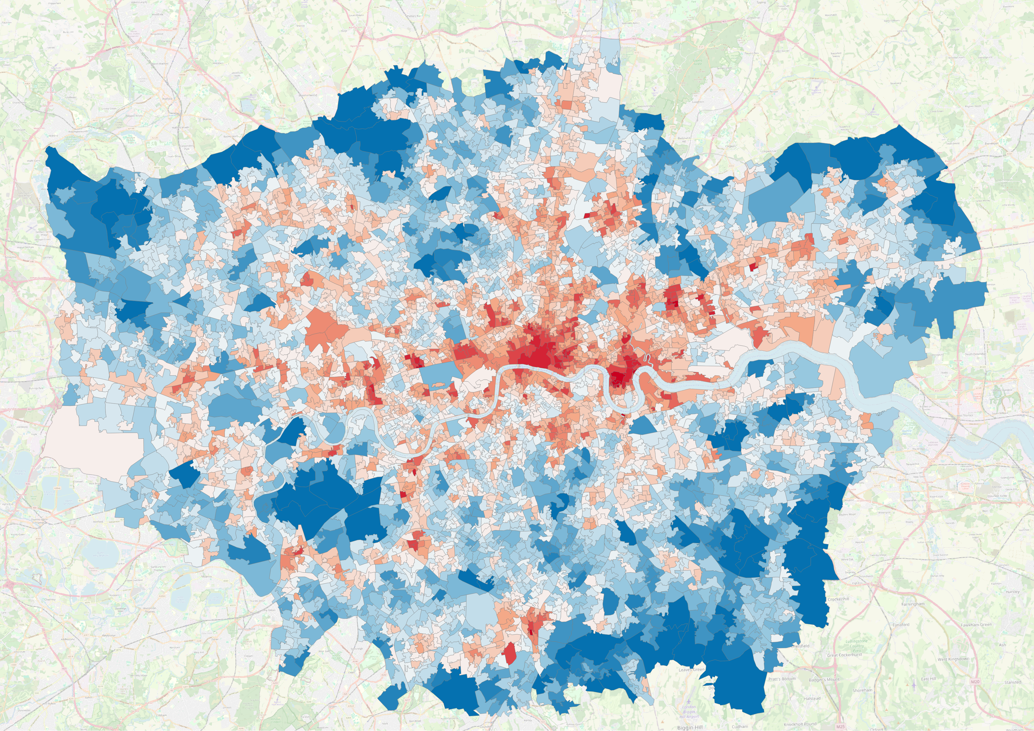
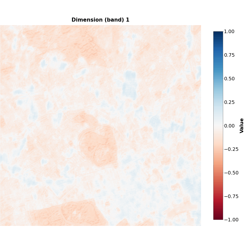
A02 dimension
(Optional)
- Let’s calculate the difference for other dimensions!
- Repeat the steps for dimension
A03_mean
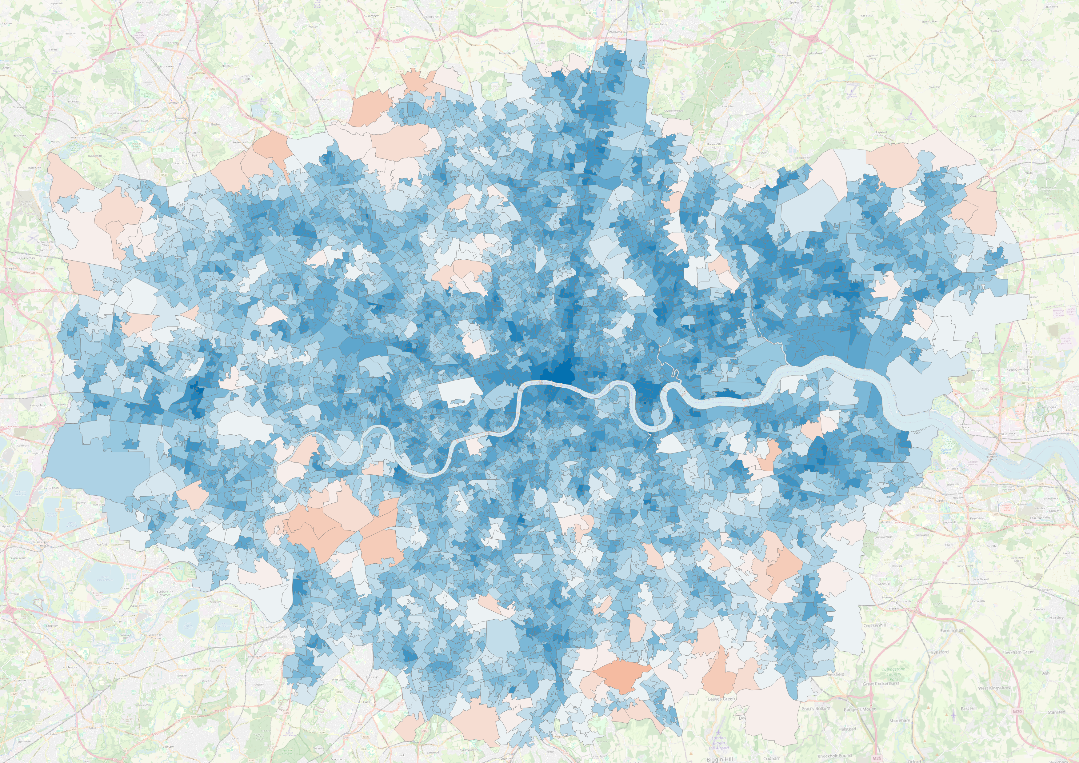
A03 dimension
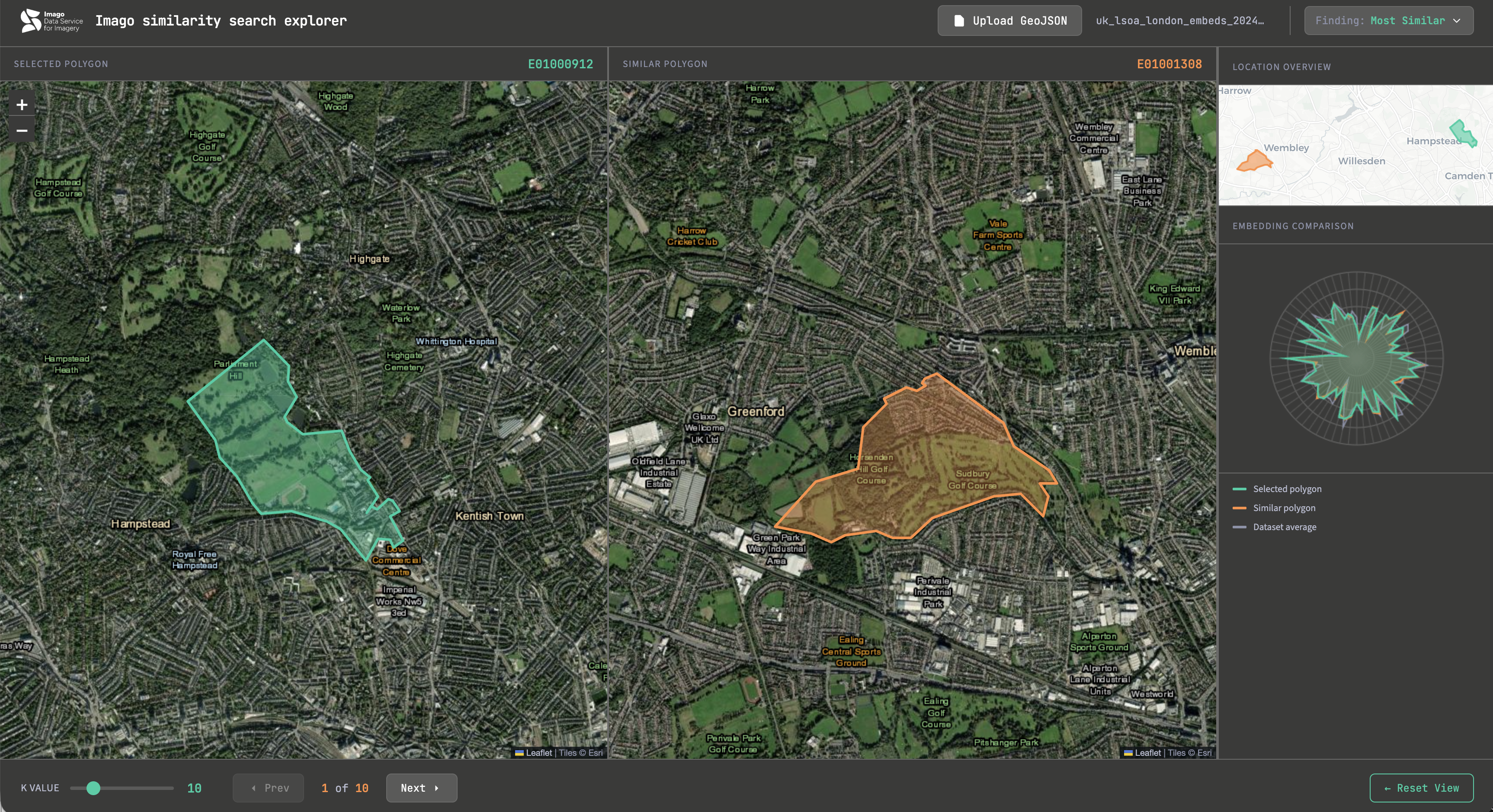
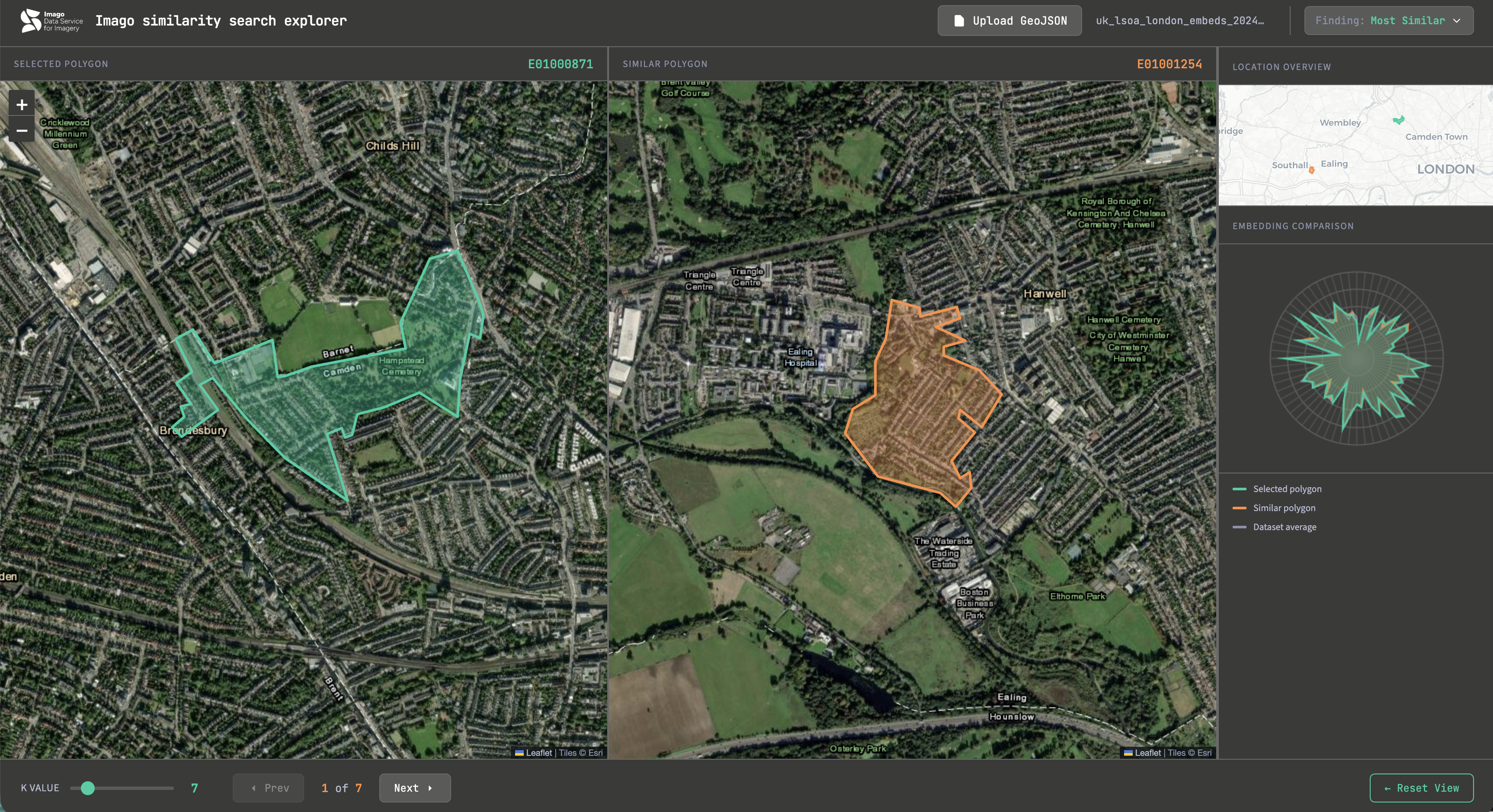
- Let’s find more similar areas…
- What about the least similar?
- Now upload the Embedding-LSOA dataset from 2024
- Do you spot differences in similar places?
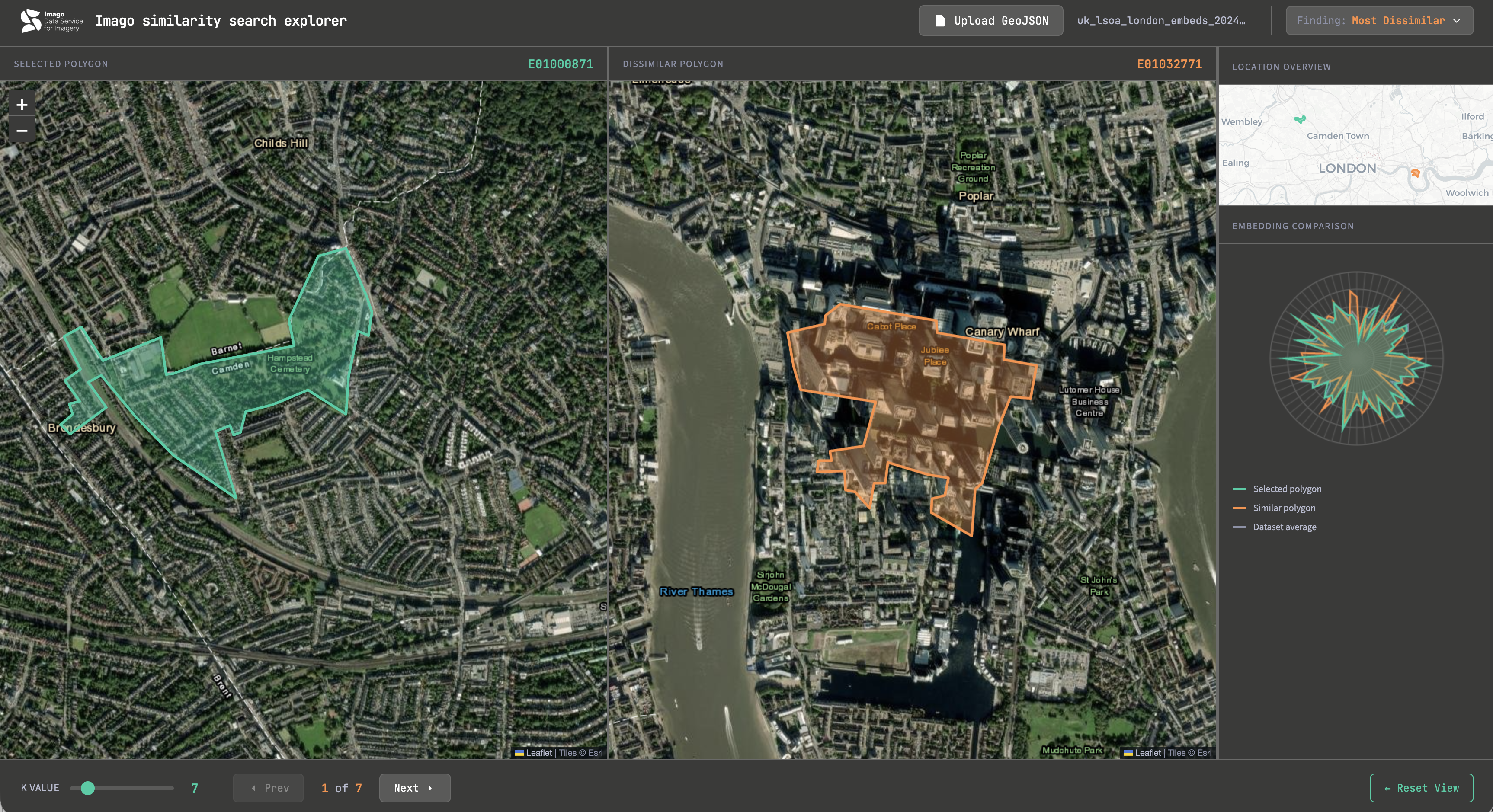
Results
Did something surprise you?
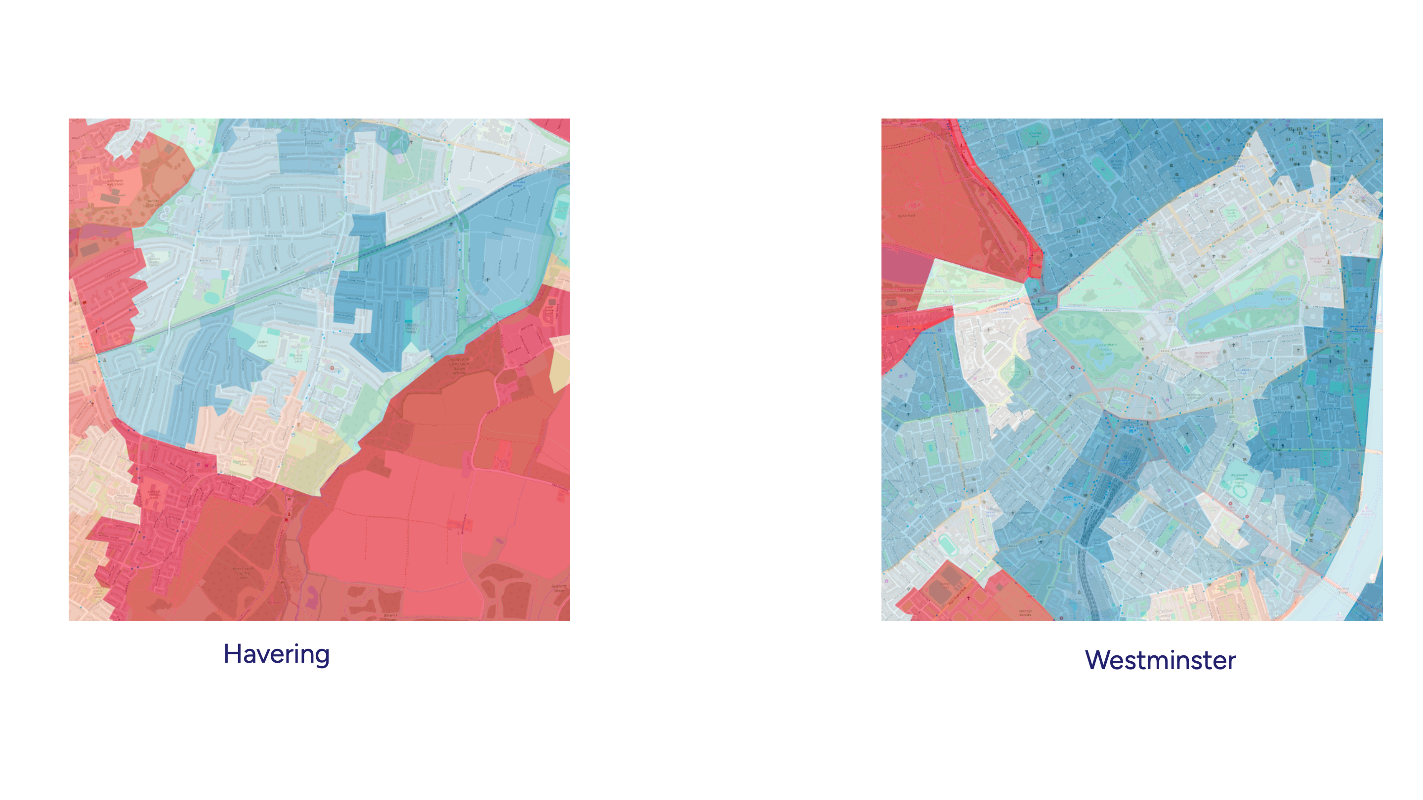
Exercise 4. London in Motion
Any prominent examples of land use or land cover changes in London (2020-2024)?
Web, AI, your memory - everything works!

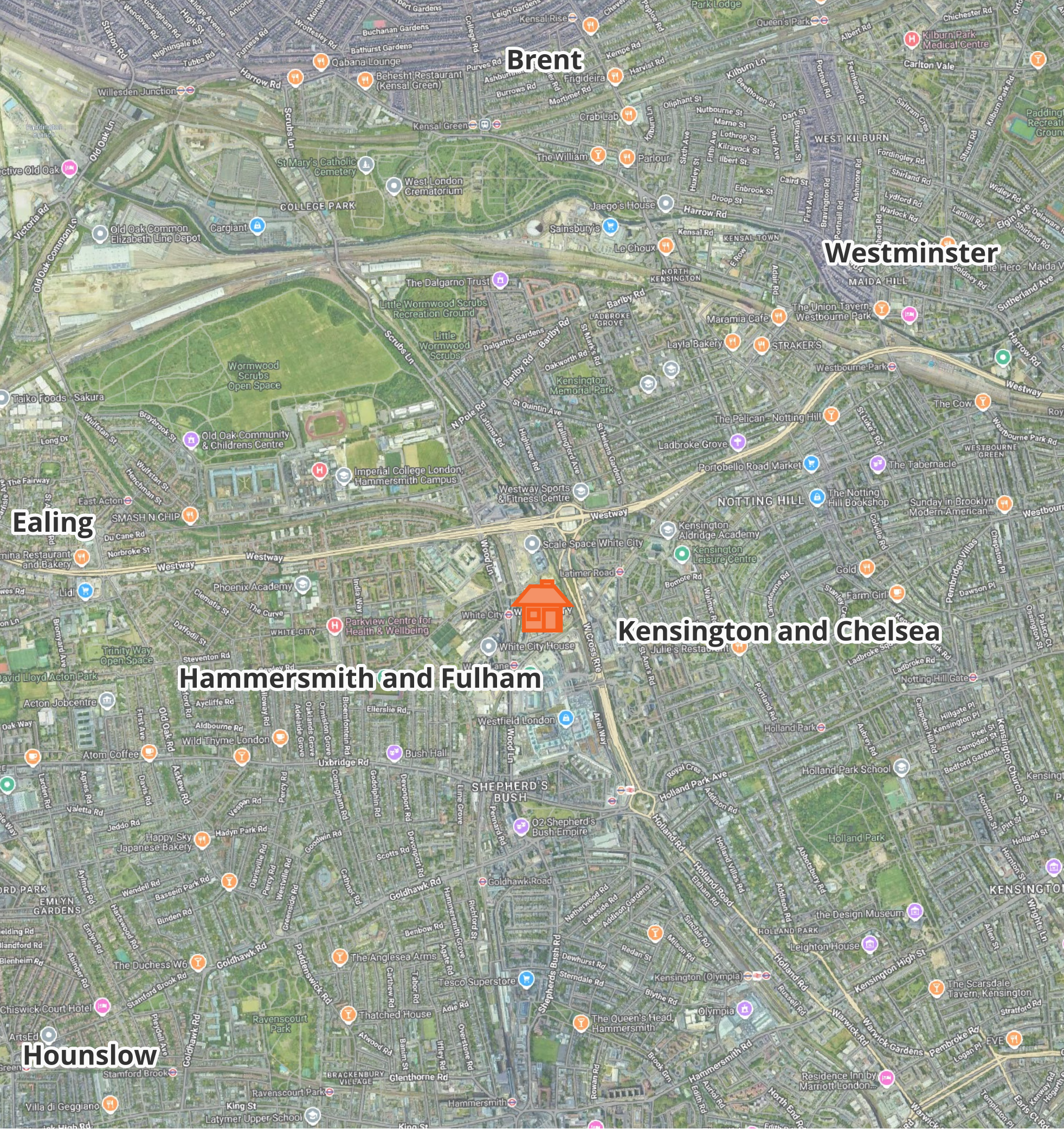
Earl’s Court development
( https://londonist.com/london/latest-news/what-s-happening-with-the-earl-s-court-development )
- Share your results!
Steps
- Open Layer Properties of Embeddings-2024 GeoPackage
- Check out
Fields-population(from ONS estimates)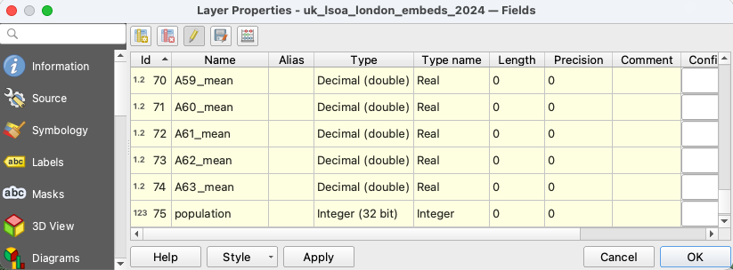
- Calculate population density:
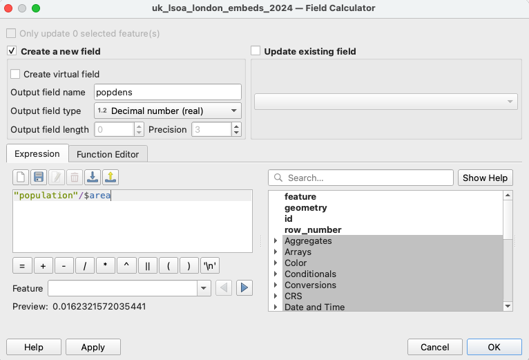
- Open
Field Calculator - Create a new field
popdens - Put expression:
("population"/$area)*1000000 - Choose
Output field type→Integer (32 bit) - Save changes
- Open
- Statistical analysis
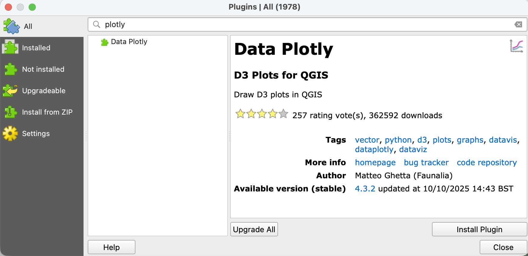
- Install Plugins → Data Plotly
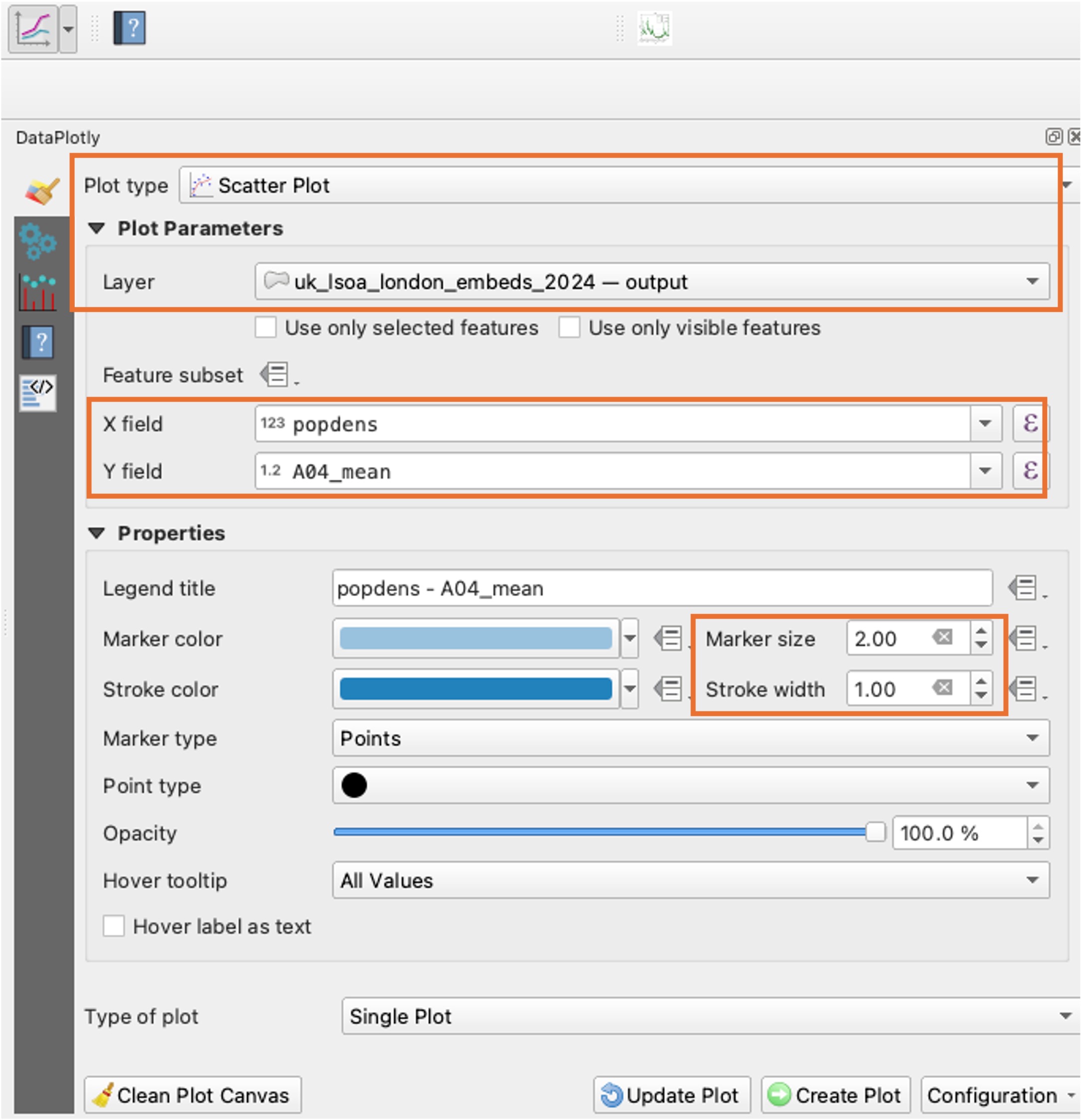
- Open DataPlotly and choose the layer with population density
Statistical analysis
- Choose plot type → Scatter Plot
- X field:
A04_mean, Y field:popdens - Change the
marker sizeto 2 and stroke width to 1 - Run
Create Plot
Statistical analysis
- Switch to the plot window
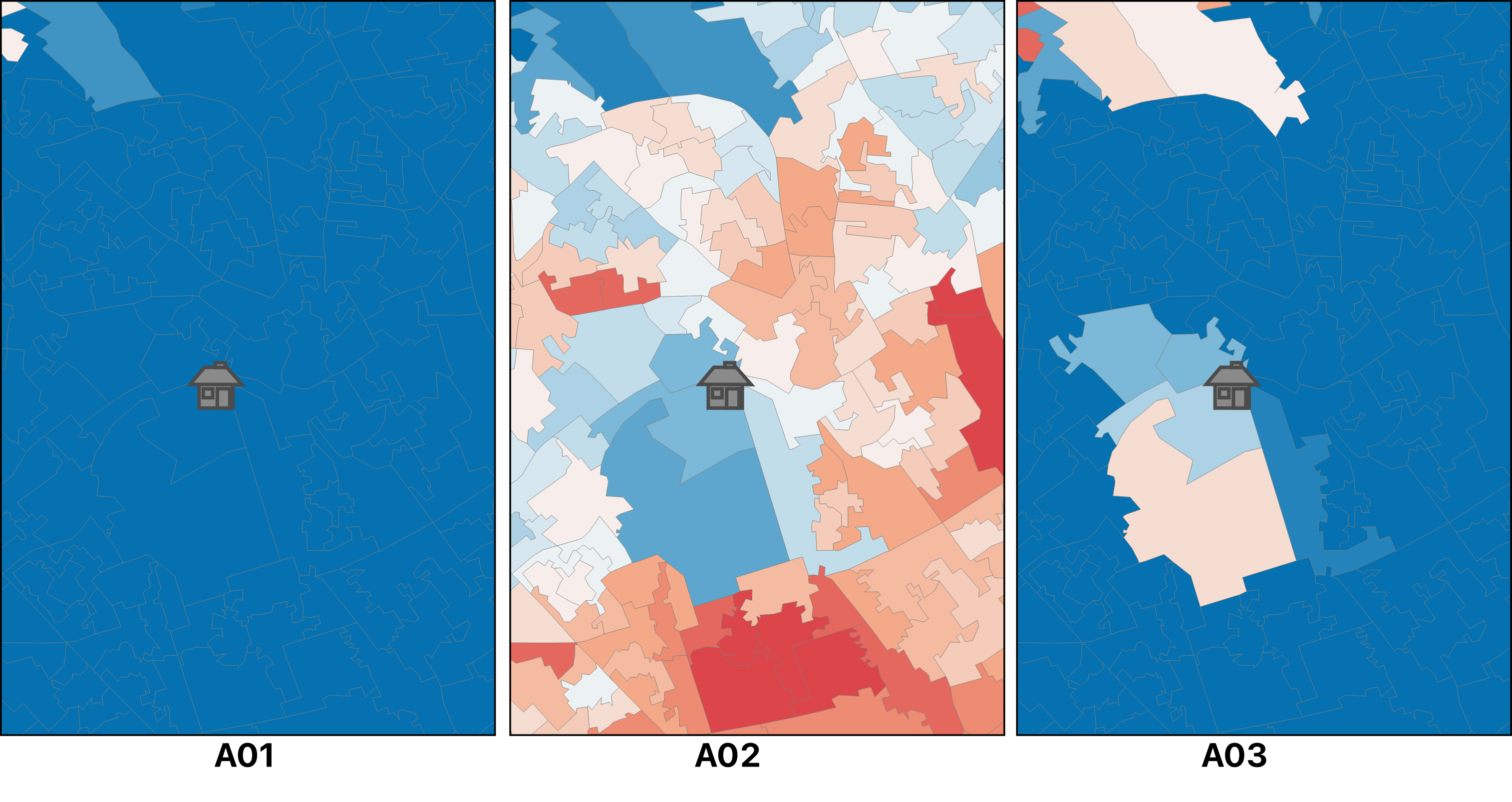
- No obvious relationship?
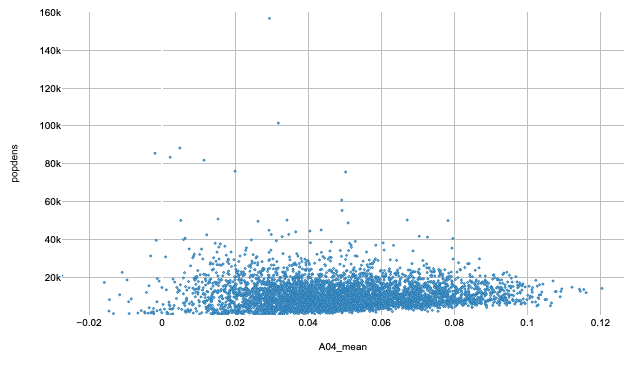
- Statistical analysis
- Switch back and clean plot canvas
- Create the same scatter plot for
A08_meancolumn - Can you see any relationship?
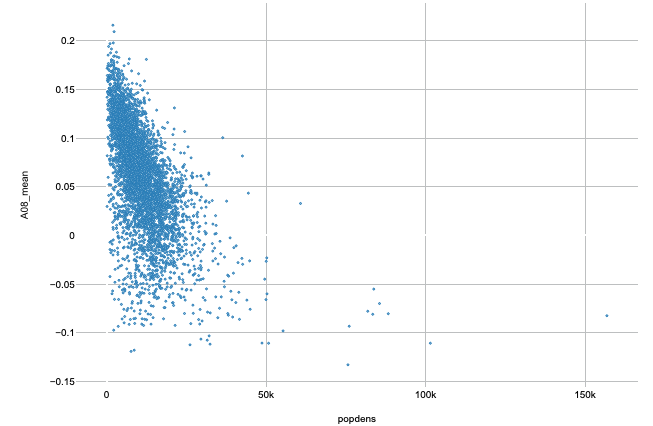
Correlations?
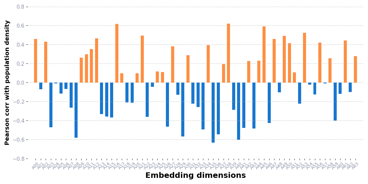
- Each band is unique but weak alone
- We can’t use just one dimension for analysis!