# Core data handling and plotting
library(tidyverse)   # Data manipulation + ggplot2

# Spatial data (used to read the per-year geopackages)
library(sf)          # Simple Features

# Python interop (only needed if rendering both languages)
library(reticulate)Air temperature - Panel
Goal: Use the Imago air temperature product to explore the relationship between heat exposure and deprivation in England. We now explore a the panel data.
Installing packages
# Standard library
import os

# Data & geospatial
import numpy as np
import pandas as pd
import geopandas as gpd

# Plotting
import matplotlib.pyplot as plt
Building air temperature panel
The Imago air temperature product publishes one geopackage per year, covering 2015 to 2024. In this section we:
- Load all ten years and stack them into a long-format panel,
- Keep only the two indicators we need (
summer_max_tmpandextreme_hot_days_mean), - Run sanity checks to confirm the panel is balanced and complete,
- Produce two descriptive figures showing what has happened nationally over the decade.
Loading 2015–2024
Each yearly file follows the convention temperature_indicators_MSOA_<year>.gpkg. We loop over the ten years, read each file, drop the geometry (to keep the panel light), keep only the columns we need, and stack the results into a single long table.
years <- 2015:2024

temp_panel <- map_dfr(years, function(yr) {
  path <- sprintf("./data/temperature_indicators_MSOA_%d.gpkg", yr)
  read_sf(path) %>%
    st_drop_geometry() %>%
    select(dt_zn_c, summer_max_tmp, extreme_hot_days_mean) %>%
    mutate(year = yr)
})

glimpse(temp_panel)
Rows: 94,480
Columns: 4
$ dt_zn_c <chr> "E02000001", "E02000002", "E02000003", "E0200000…
$ summer_max_tmp <dbl> 22.45660, 22.23397, 22.30941, 22.43266, 22.39275…
$ extreme_hot_days_mean <dbl> 3.000000, 2.000000, 2.000000, 2.000000, 2.000000…
$ year <int> 2015, 2015, 2015, 2015, 2015, 2015, 2015, 2015, …years = list(range(2015, 2025))
frames = []
for yr in years:
path = f"./data/temperature_indicators_MSOA_{yr}.gpkg"
df = (
gpd.read_file(path)
.drop(columns="geometry")
[["dt_zn_c", "summer_max_tmp", "extreme_hot_days_mean"]]
.assign(year=yr)
)
frames.append(df)
temp_panel = pd.concat(frames, ignore_index=True)
temp_panel.info()<class 'pandas.DataFrame'>
RangeIndex: 94480 entries, 0 to 94479
Data columns (total 4 columns):
# Column Non-Null Count Dtype
--- ------ -------------- -----
0 dt_zn_c 94480 non-null str
1 summer_max_tmp 94480 non-null float64
2 extreme_hot_days_mean 94480 non-null float64
3 year 94480 non-null int64
dtypes: float64(2), int64(1), str(1)
memory usage: 2.9 MBPanel diagnostics
Before doing anything analytical, we check that the panel behaves as expected. Three questions:
- How many MSOAs do we have per year?
- Is the panel balanced — does every MSOA appear in every year?
- Are there missing values in either of our two indicators?
# 1. MSOAs per year
temp_panel %>%
  count(year, name = "n_msoa")
# A tibble: 10 × 2
year n_msoa
<int> <int>
1 2015 9448
2 2016 9448
3 2017 9448
4 2018 9448
5 2019 9448
6 2020 9448
7 2021 9448
8 2022 9448
9 2023 9448
10 2024 9448# 2. Balanced panel check — does every MSOA appear in all 10 years?
years_per_msoa <- temp_panel %>%
count(dt_zn_c, name = "n_years")
table(years_per_msoa$n_years)
  10
9448
# 3. Missing values per indicator per year
temp_panel %>%
group_by(year) %>%
summarise(
n_total = n(),
miss_summer_max_tmp = sum(is.na(summer_max_tmp)),
miss_extreme_hot_days = sum(is.na(extreme_hot_days_mean))
)# A tibble: 10 × 4
year n_total miss_summer_max_tmp miss_extreme_hot_days
<int> <int> <int> <int>
1 2015 9448 0 0
2 2016 9448 0 0
3 2017 9448 0 0
4 2018 9448 0 0
5 2019 9448 0 0
6 2020 9448 0 0
7 2021 9448 0 0
8 2022 9448 0 0
9 2023 9448 0 0
10 2024 9448 0 0# 1. MSOAs per year
print(temp_panel.groupby("year").size().rename("n_msoa"))year
2015 9448
2016 9448
2017 9448
2018 9448
2019 9448
2020 9448
2021 9448
2022 9448
2023 9448
2024 9448
Name: n_msoa, dtype: int64# 2. Balanced panel check — does every MSOA appear in all 10 years?
years_per_msoa = temp_panel.groupby("dt_zn_c").size().rename("n_years")
print(years_per_msoa.value_counts())n_years
10 9448
Name: count, dtype: int64# 3. Missing values per indicator per year
print(
temp_panel
.groupby("year")
.agg(
n_total=("dt_zn_c", "size"),
miss_summer_max_tmp=("summer_max_tmp", lambda s: s.isna().sum()),
miss_extreme_hot_days=("extreme_hot_days_mean", lambda s: s.isna().sum()),
)
) n_total miss_summer_max_tmp miss_extreme_hot_days
year
2015 9448 0 0
2016 9448 0 0
2017 9448 0 0
2018 9448 0 0
2019 9448 0 0
2020 9448 0 0
2021 9448 0 0
2022 9448 0 0
2023 9448 0 0
2024 9448 0 0If the panel is balanced and complete, we can move on. If not, it is worth investigating before proceeding — unbalanced panels are not fatal but they do affect how some estimators behave.
National trends over the decade
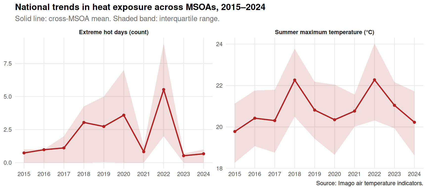
A first look: how have these two indicators evolved nationally? We compute the cross-MSOA mean and the interquartile range each year, and plot them.
national_trends <- temp_panel %>%
  pivot_longer(
    cols = c(summer_max_tmp, extreme_hot_days_mean),
    names_to = "indicator",
    values_to = "value"
  ) %>%
  group_by(year, indicator) %>%
  summarise(
    mean_val = mean(value, na.rm = TRUE),
    q25      = quantile(value, 0.25, na.rm = TRUE),
    q75      = quantile(value, 0.75, na.rm = TRUE),
    .groups = "drop"
  ) %>%
  mutate(
    indicator_label = recode(indicator,
      "summer_max_tmp"        = "Summer maximum temperature (°C)",
      "extreme_hot_days_mean" = "Extreme hot days (count)"
    )
)ggplot(national_trends, aes(x = year, y = mean_val)) +
geom_ribbon(aes(ymin = q25, ymax = q75), fill = "firebrick", alpha = 0.15) +
geom_line(colour = "firebrick", linewidth = 0.9) +
geom_point(colour = "firebrick", size = 1.5) +
facet_wrap(~ indicator_label, scales = "free_y") +
scale_x_continuous(breaks = years) +
labs(
title = "National trends in heat exposure across MSOAs, 2015–2024",
subtitle = "Solid line: cross-MSOA mean. Shaded band: interquartile range.",
x = NULL, y = NULL,
caption = "Source: Imago air temperature indicators."
) +
theme_minimal(base_size = 11) +
theme(
plot.title = element_text(face = "bold"),
plot.subtitle = element_text(colour = "grey40"),
strip.text = element_text(face = "bold"),
panel.grid.minor = element_blank()
)
national_trends = (
    temp_panel
    .melt(id_vars=["dt_zn_c", "year"],
          value_vars=["summer_max_tmp", "extreme_hot_days_mean"],
          var_name="indicator", value_name="value")
    .groupby(["year", "indicator"], as_index=False)
    .agg(
        mean_val=("value", "mean"),
        q25=("value", lambda s: s.quantile(0.25)),
        q75=("value", lambda s: s.quantile(0.75)),
    )
)

label_map = {
    "summer_max_tmp": "Summer maximum temperature (°C)",
    "extreme_hot_days_mean": "Extreme hot days (count)",
}
national_trends["indicator_label"] = national_trends["indicator"].map(label_map)

fig, axes = plt.subplots(1, 2, figsize=(11, 4), sharex=True)
order = ["extreme_hot_days_mean", "summer_max_tmp"]

for ax, ind in zip(axes, order):
    sub = national_trends[national_trends["indicator"] == ind]
    ax.fill_between(sub["year"], sub["q25"], sub["q75"],
                    color="firebrick", alpha=0.15)
    ax.plot(sub["year"], sub["mean_val"],
            color="firebrick", linewidth=1.4, marker="o")
    ax.set_title(label_map[ind], fontweight="bold")
    ax.set_xticks(years)
    ax.grid(axis="y", linestyle="--", alpha=0.4)

fig.suptitle("National trends in heat exposure across MSOAs, 2015–2024",
             fontweight="bold", y=1.02)
fig.text(0.5, -0.02,
         "Solid line: cross-MSOA mean. Shaded band: interquartile range.",
         ha="center", color="grey", fontsize=9)

plt.tight_layout()
plt.show()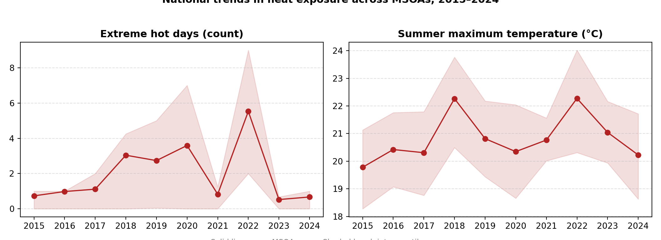
Two things to look for in the figure: (i) is there a level trend in either indicator, and (ii) is the IQR widening, narrowing, or stable? A widening IQR would suggest all MSOAs are not warming together — already a hint that the inequality story may be live.
A sample of trajectories
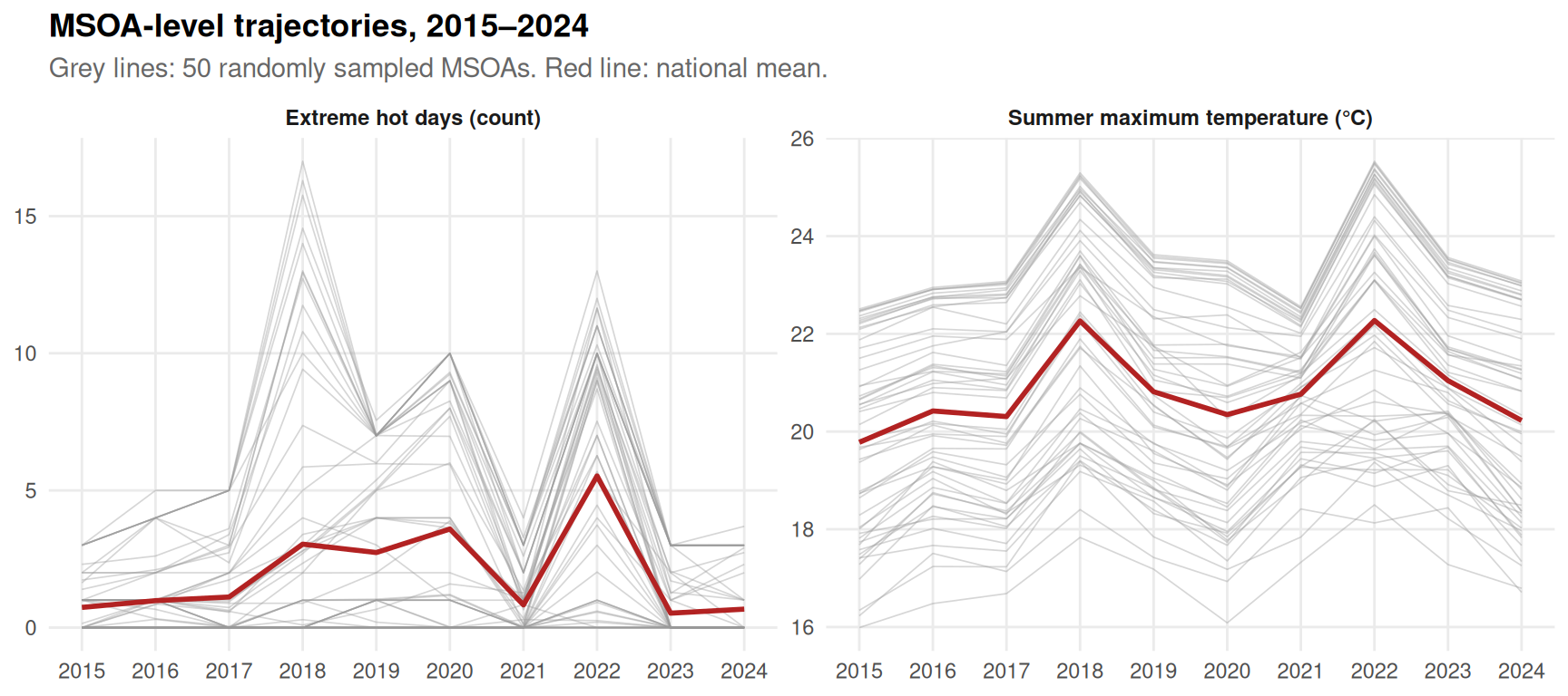
The national mean hides a lot. To see panel structure directly, we plot the trajectories of 50 randomly sampled MSOAs against the national mean.
set.seed(42)

sample_codes <- temp_panel %>%
  distinct(dt_zn_c) %>%
  slice_sample(n = 50) %>%
  pull(dt_zn_c)

trajectories <- temp_panel %>%
  filter(dt_zn_c %in% sample_codes) %>%
  pivot_longer(
    cols = c(summer_max_tmp, extreme_hot_days_mean),
    names_to = "indicator",
    values_to = "value"
  ) %>%
  mutate(
    indicator_label = recode(indicator,
      "summer_max_tmp"        = "Summer maximum temperature (°C)",
      "extreme_hot_days_mean" = "Extreme hot days (count)"
    )
  )

national_means <- national_trends %>%
select(year, indicator, indicator_label, mean_val)ggplot() +
geom_line(
data = trajectories,
aes(x = year, y = value, group = dt_zn_c),
colour = "grey60", alpha = 0.4, linewidth = 0.3
) +
geom_line(
data = national_means,
aes(x = year, y = mean_val),
colour = "firebrick", linewidth = 1
) +
facet_wrap(~ indicator_label, scales = "free_y") +
scale_x_continuous(breaks = years) +
labs(
title = "MSOA-level trajectories, 2015–2024",
subtitle = "Grey lines: 50 randomly sampled MSOAs. Red line: national mean.",
x = NULL, y = NULL
) +
theme_minimal(base_size = 11) +
theme(
plot.title = element_text(face = "bold"),
plot.subtitle = element_text(colour = "grey40"),
strip.text = element_text(face = "bold"),
panel.grid.minor = element_blank()
)
rng = np.random.default_rng(42)

all_codes = temp_panel["dt_zn_c"].unique()
sample_codes = rng.choice(all_codes, size=50, replace=False)

trajectories = (
    temp_panel[temp_panel["dt_zn_c"].isin(sample_codes)]
    .melt(id_vars=["dt_zn_c", "year"],
          value_vars=["summer_max_tmp", "extreme_hot_days_mean"],
          var_name="indicator", value_name="value")
)
trajectories["indicator_label"] = trajectories["indicator"].map(label_map)

fig, axes = plt.subplots(1, 2, figsize=(11, 4), sharex=True)

for ax, ind in zip(axes, order):
    sub_t = trajectories[trajectories["indicator"] == ind]
    for code, grp in sub_t.groupby("dt_zn_c"):
        ax.plot(grp["year"], grp["value"],
                color="grey", alpha=0.4, linewidth=0.5)
    sub_n = national_trends[national_trends["indicator"] == ind]
    ax.plot(sub_n["year"], sub_n["mean_val"],
            color="firebrick", linewidth=1.6)
    ax.set_title(label_map[ind], fontweight="bold")
    ax.set_xticks(years)
    ax.grid(axis="y", linestyle="--", alpha=0.4)

fig.suptitle("MSOA-level trajectories, 2015–2024",
             fontweight="bold", y=1.02)
fig.text(0.5, -0.02,
         "Grey lines: 50 randomly sampled MSOAs. Red line: national mean.",
         ha="center", color="grey", fontsize=9)

plt.tight_layout()
plt.show()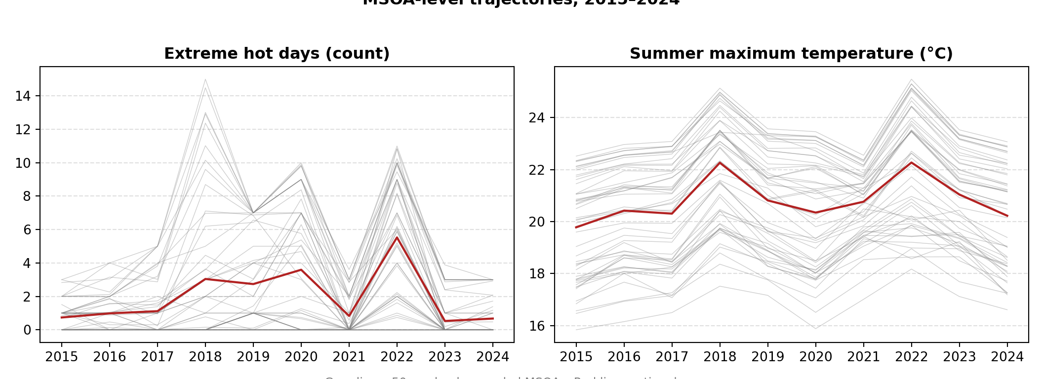
The trajectories make two things visible. First, individual MSOAs are noisy from year to year — single-year cross-sections (like Part 1) can be misleading. Second, the spread between MSOAs is large and the lines do not look parallel: some MSOAs may be warming faster than others. That is exactly the question Part 3 takes up.
Save the panel
We save the assembled panel so Part 3 can pick it up without re-reading all ten geopackages.
dir.create("./data/derived", showWarnings = FALSE, recursive = TRUE)
write_csv(temp_panel, "./data/derived/temp_panel_2015_2024.csv")os.makedirs("./data/derived", exist_ok=True)
temp_panel.to_csv("./data/derived/temp_panel_2015_2024.csv", index=False)