import geopandas as gpd
import numpy as np
import matplotlib.pyplot as plt
import pandas as pd
from IPython.display import display
from scipy.stats import pearsonrSun Probability Framework - SPF & General Health
Data:
Goal: Investigate how Sun Probability Framework (SPF) values vary across communities with different levels of self-reported general health in England and Wales.
NoteInstalling the data
Download the 2025 SPF dataset from the Imago Data Service.
Download the Census 2021 General Health data at LSOA level. Select all columns, LSOA, values, and area codes.
Place both files inside the /data directory. Rename the census csv to generalhealth.csv.
The SPF dataset provides annual estimates of the SPF for every small area across the UK. The Census dataset provides counts of residents reporting different levels of general health in the 2021 Census.
Why?
Environmental conditions are not necessarily experienced equally across society.
Researchers are often interested in whether environmental characteristics vary systematically with characteristics of the populations living in different areas. Comparing SPF with Census measures of general health allows us to investigate whether communities with different levels of self-reported health tend to experience different cloud cover conditions.
This analysis does not attempt to establish that cloud cover conditions cause differences in health. Instead, it investigates whether a spatial association exists between the two variables and considers possible explanations and limitations.
The Census measure of general health is based on how residents assessed their own health, ranging from very good to very bad.
Installing Libraries
Loading the datasets
spf = gpd.read_file("data/Cloud probability statistics per small area in 2025 (GeoPackage).gpkg")

health = pd.read_csv(
    "data/general_health.csv", skiprows=6, skipfooter=6, engine="python"
)
Understanding the datasets
display(spf.head())

display(health.head())| data_zone_code | cloud_probability | geometry | |
|---|---|---|---|
| 0 | E01000001 | 65.8183 | MULTIPOLYGON (((532105.312 182010.574, 532162.... |
| 1 | E01000002 | 65.0145 | MULTIPOLYGON (((532634.497 181926.016, 532619.... |
| 2 | E01000003 | 67.9649 | MULTIPOLYGON (((532135.138 182198.131, 532158.... |
| 3 | E01000005 | 64.9263 | MULTIPOLYGON (((533808.018 180767.774, 533649.... |
| 4 | E01000006 | 65.9036 | MULTIPOLYGON (((545122.049 184314.931, 545271.... |
| 2021 super output area - lower layer | mnemonic | Total: All usual residents | Very good health | Good health | Fair health | Bad health | Very bad health | |
|---|---|---|---|---|---|---|---|---|
| 0 | NaN | NaN | NaN | NaN | NaN | NaN | NaN | NaN |
| 1 | Hartlepool 001A | E01011954 | 2283.0 | 970.0 | 767.0 | 381.0 | 130.0 | 35.0 |
| 2 | Hartlepool 001B | E01011969 | 1345.0 | 574.0 | 460.0 | 228.0 | 60.0 | 23.0 |
| 3 | Hartlepool 001C | E01011970 | 1070.0 | 485.0 | 393.0 | 142.0 | 38.0 | 12.0 |
| 4 | Hartlepool 001D | E01011971 | 1323.0 | 743.0 | 410.0 | 136.0 | 27.0 | 7.0 |
Note
The SPF dataset contains annual average SPF values for every small area.
The Census health categories are:
- Very good health
- Good health
- Fair health
- Bad health
- Very bad health
The Census data provides counts rather than percentages. This allows us to calculate the proportions ourselves.
Preparing Census Data
health.drop(health.index[0], inplace = True)
health = health.rename(
    columns={
        "2021 super output area - lower layer": "lsoa_name",
        "mnemonic": "data_zone_code",
        "Total: All usual residents": "total",
        "Very good health": "very_good",
        "Good health": "good",
        "Fair health": "fair",
        "Bad health": "bad",
        "Very bad health": "very_bad",
    }
).reindex()
health.columns
health.head()| lsoa_name | data_zone_code | total | very_good | good | fair | bad | very_bad | |
|---|---|---|---|---|---|---|---|---|
| 1 | Hartlepool 001A | E01011954 | 2283.0 | 970.0 | 767.0 | 381.0 | 130.0 | 35.0 |
| 2 | Hartlepool 001B | E01011969 | 1345.0 | 574.0 | 460.0 | 228.0 | 60.0 | 23.0 |
| 3 | Hartlepool 001C | E01011970 | 1070.0 | 485.0 | 393.0 | 142.0 | 38.0 | 12.0 |
| 4 | Hartlepool 001D | E01011971 | 1323.0 | 743.0 | 410.0 | 136.0 | 27.0 | 7.0 |
| 5 | Hartlepool 001F | E01033465 | 1955.0 | 1098.0 | 613.0 | 181.0 | 48.0 | 15.0 |
Creating health measures
Counts are difficult to compare directly because LSOAs contain different numbers of people. Instead, we convert the counts into percentages.
Good health
health["good_health_percent"] = (
    100 * (health["very_good"] + health["good"]) / health["total"]
)
Poor health
We will use the inverse of Good health so bad + very bad health as our principal measure.
health["poor_health_percent"] = (
    100 * (health["bad"] + health["very_bad"]) / health["total"]
)
Fair health
Finally we calculate the percentage of fair health.
health["fair_health_percent"] = 100 * health["fair"] / health["total"]We can inspect the resulting variables:
display(
    health[
        [
            "data_zone_code",
            "good_health_percent",
            "fair_health_percent",
            "poor_health_percent",
        ]
    ].head()
)| data_zone_code | good_health_percent | fair_health_percent | poor_health_percent | |
|---|---|---|---|---|
| 1 | E01011954 | 76.084100 | 16.688568 | 7.227332 |
| 2 | E01011969 | 76.877323 | 16.951673 | 6.171004 |
| 3 | E01011970 | 82.056075 | 13.271028 | 4.672897 |
| 4 | E01011971 | 87.150416 | 10.279667 | 2.569917 |
| 5 | E01033465 | 87.519182 | 9.258312 | 3.222506 |
Merging the datasets
The SPF dataset uses the 2021 LSOA code as data_zone_code. However, it includes Northern Ireland as well as Wales, Scotland and England. The Census dataset only includes England and Wales, so we will commit to a right join. This will automatically drop areas where we have no health data.
We therefore merge the health data using the same identifier.
health = health[
    [
        "data_zone_code",
        "good_health_percent",
        "fair_health_percent",
        "poor_health_percent",
    ]
]

combined = spf.merge(
    health,
    on="data_zone_code",
    how="right"
)

print(f"SPF LSOAs: {len(combined)}")
combined.head()
SPF LSOAs: 35673| data_zone_code | cloud_probability | geometry | good_health_percent | fair_health_percent | poor_health_percent | |
|---|---|---|---|---|---|---|
| 0 | E01011954 | 69.1318 | MULTIPOLYGON (((449388.067 535063.669, 449203.... | 76.084100 | 16.688568 | 7.227332 |
| 1 | E01011969 | 70.1876 | MULTIPOLYGON (((448986.938 536728.788, 449279.... | 76.877323 | 16.951673 | 6.171004 |
| 2 | E01011970 | 69.9663 | MULTIPOLYGON (((448456.616 536053.042, 448446.... | 82.056075 | 13.271028 | 4.672897 |
| 3 | E01011971 | 70.7784 | MULTIPOLYGON (((448133.076 535759.035, 448149 ... | 87.150416 | 10.279667 | 2.569917 |
| 4 | E01033465 | 70.0127 | MULTIPOLYGON (((448713.645 535548.757, 448923.... | 87.519182 | 9.258312 | 3.222506 |
Maps!
Before investigating relationships between the variables, it is useful to visualise them independently.
This allows us to understand their spatial distributions before comparing them.
SPF Map
fig, ax = plt.subplots(figsize=(10, 10))

combined.plot(
    column="cloud_probability",
    cmap="Blues",
    legend=True,
    ax=ax,
)

ax.axis("off")

ax.set_title(
    "Mean Annual Cloud Probability (2025)",
    fontweight="bold",
)

plt.tight_layout()
plt.show()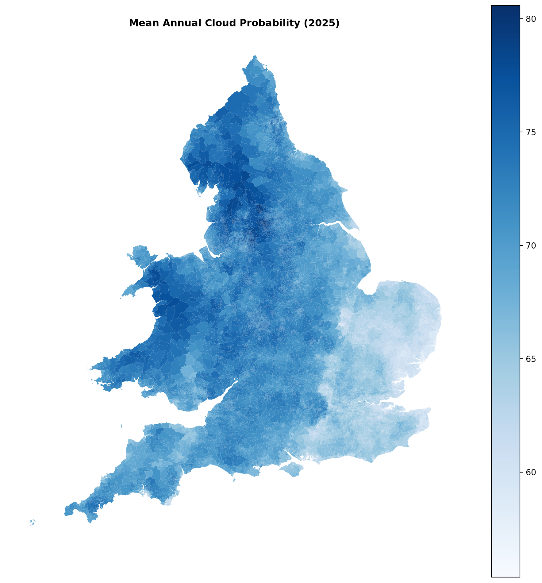
Note
Interpretation
The SPF map shows substantial spatial variation across England and Wales.
Remember that SPF represents the probability of cloud cover rather than the amount of sunlight itself. This means that:
- Higher SPF = greater probability of cloud cover
- Lower SPF = lower probability of cloud cover
Consequently, areas with lower SPF values represent areas where clearer conditions are more likely - for example in the South East of England - while areas with higher SPF values represent areas where cloudier conditions are more likely - for example in Wales or along the Pennines.
The map provides the environmental context for the remainder of the analysis.
General Health Map
We now map the proportion of residents reporting bad or very bad general health.
from matplotlib.colors import TwoSlopeNorm

mean_val = combined["poor_health_percent"].mean()
median_val = combined["poor_health_percent"].median()

norm = TwoSlopeNorm(
    vmin=combined["poor_health_percent"].min(),
    vcenter=mean_val,
    vmax=combined["poor_health_percent"].max(),
)

fig, ax = plt.subplots(figsize=(10, 10))

combined.plot(
    column="poor_health_percent",
    cmap="RdBu_r",
    norm=norm,
    legend=True,
    ax=ax,
)

# Mark the mean and median on the colorbar
cbar = ax.get_figure().axes[-1]
cbar.axhline(mean_val, color="black", linewidth=1.2)
cbar.axhline(median_val, color="black", linewidth=1.2, linestyle="--")

cbar.text(1.3, mean_val, f"Mean: {mean_val:.1f}%", va="center", transform=cbar.get_yaxis_transform())
cbar.text(1.3, median_val, f"Median: {median_val:.1f}%", va="center", transform=cbar.get_yaxis_transform())

ax.axis("off")

ax.set_title(
    "Residents Reporting Bad or Very Bad Health, Relative to the National Mean (2021)",
    fontweight="bold",
)

plt.tight_layout()
plt.show()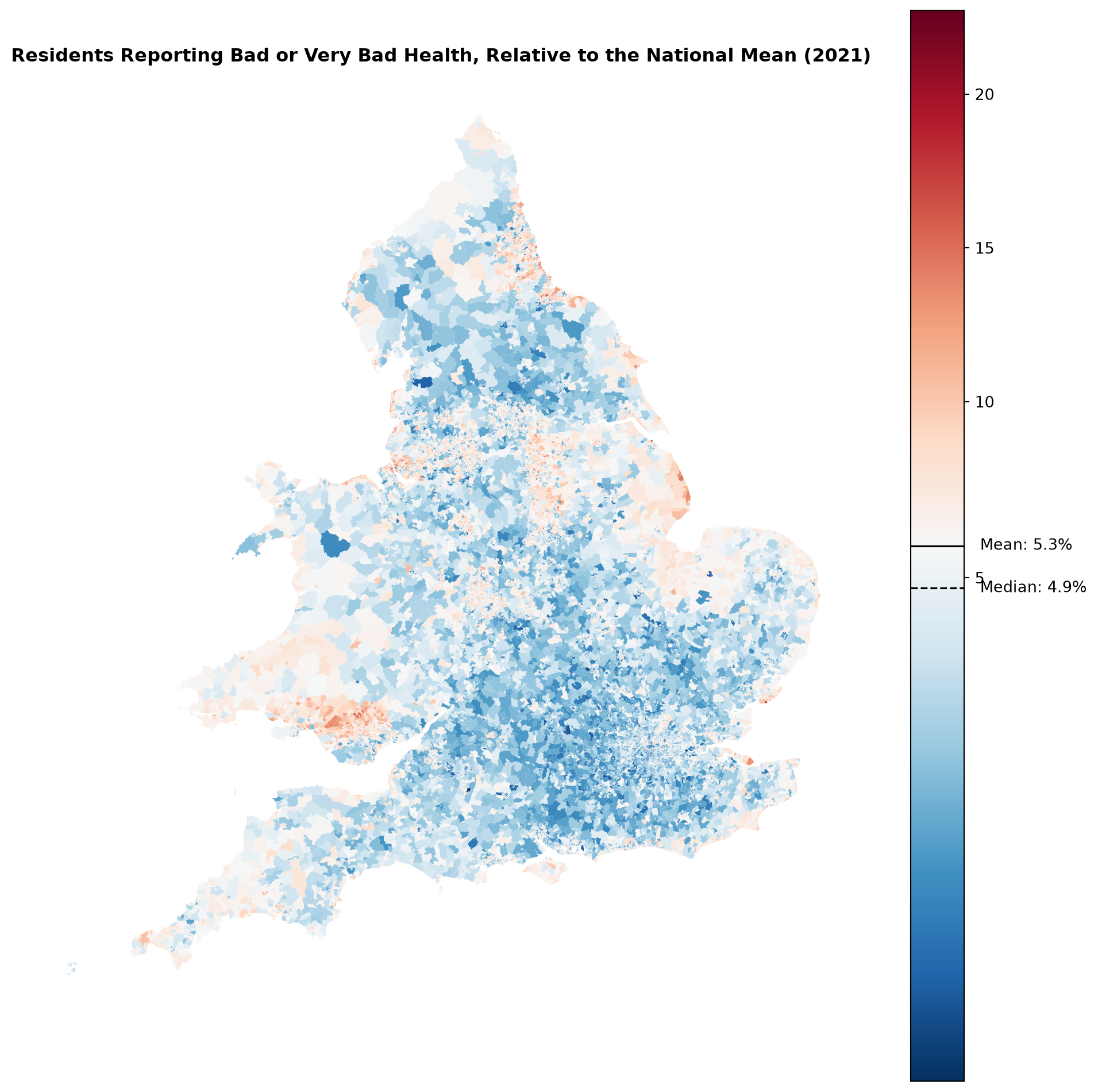
Interpretation
Self-expressed poor health, relative to the national mean, provides a clearer picture, highlighting vulnerable LSOAs. Most of England is below average — fewer people self-assessed their health as bad or very bad than the national mean — across London, the South East, the South West, and East Anglia, with very little red mixed in.
Poor health is instead concentrated in a small number of distinct clusters: South Wales, particularly the coastal belt through Swansea and Llanelli and into the Valleys, and the area around Hull and the Humber estuary, which stands out clearly from the rest of Yorkshire. Smaller, more scattered pockets of poorer health also appear around some former mill towns in West Yorkshire, but without the same regional coherence as the South Wales and Hull clusters.
Comparing SPF Across Health Groups
To investigate whether SPF varies systematically with health, we divide LSOAs into five groups according to their level of poor self-reported health.
Quintiles divide the LSOAs into five approximately equal sized groups.
combined["health_quintile"] = pd.qcut(
    combined["poor_health_percent"],
    q=5,
    labels=[
        "Lowest poor health",
        "Low",
        "Medium",
        "High",
        "Highest poor health",
    ],
)
We can calculate the mean and median SPF within each group.
health_summary = combined.groupby("health_quintile", observed=False).agg(
    Mean_SPF=("cloud_probability", "mean"),
    Median_SPF=("cloud_probability", "median"),
    SD_SPF=("cloud_probability", "std"),
    Count=("cloud_probability", "count"),
).round(1)
health_summary| Mean_SPF | Median_SPF | SD_SPF | Count | |
|---|---|---|---|---|
| health_quintile | ||||
| Lowest poor health | 68.8 | 68.4 | 3.9 | 7135 |
| Low | 69.1 | 69.5 | 4.2 | 7134 |
| Medium | 69.5 | 70.2 | 4.3 | 7134 |
| High | 70.0 | 71.1 | 4.4 | 7134 |
| Highest poor health | 70.8 | 71.7 | 3.9 | 7135 |
And a figure to visualise the distribution of SPF across the health quintiles.
fig, ax = plt.subplots(figsize=(8, 5))

combined.boxplot(
    column="cloud_probability",
    by="health_quintile",
    ax=ax,
    grid=False,
)

ax.set_title("SPF Distribution by Health Quintile")
plt.suptitle("")
ax.set_xlabel("Health Quintile")
ax.set_ylabel("SPF (cloud probability)")

plt.tight_layout()
plt.show()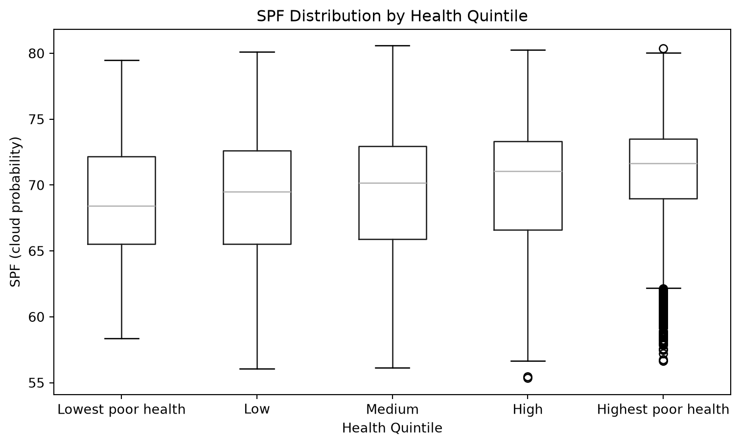
This comparison allows us to ask a simple question:
- Do LSOAs with different levels of poor self-reported health tend to have different SPF values?
Mean SPF rises consistently across the quintiles, from 68.8 in the lowest poor-health group to 70.8 in the highest — a difference of 2 points, or roughly half a standard deviation (SD ≈ 4 within each quintile). The increase is also monotonic: each successive quintile has a higher mean SPF than the one before it. This is a moderate but real shift rather than a dramatic one — individual LSOAs vary considerably within any given quintile, and the boxplots below show substantial overlap between adjacent groups — but the consistent, stepwise pattern across all five groups suggests areas with greater levels of reported poor health tend to experience higher probabilities of cloud cover.
Notably, the highest poor-health quintile also contains a distinct cluster of low-SPF outliers. There is a sizeable group of LSOAs combining high poor-health with comparatively clear skies, running counter to that group’s overall pattern. This is a reminder that quintile averages can mask meaningful sub-groups within them.
However, a difference between groups does not tell us why the difference exists.
Correlation
So, we can use a simple correlation to examine the relationship in more detail.
clean = combined[["poor_health_percent", "cloud_probability"]].dropna()

correlation, p_value = pearsonr(
    clean["poor_health_percent"],
    clean["cloud_probability"],
)

print(f"Pearson correlation: {correlation:.3f}")
print(f"P-value: {p_value:.3e}")
print(f"N used: {len(clean)} (dropped {len(combined) - len(clean)})")
Pearson correlation: 0.164
P-value: 6.774e-214
N used: 35672 (dropped 1)
Note
The Pearson correlation measures the strength and direction of the linear relationship between the percentage reporting bad or very bad health and SPF.
The positive value of 0.164 confirms a real association in the expected direction, but it is a weak one — SPF explains only a small fraction of the variation in poor health across LSOAs (r² ≈ 0.027, or about 2.7%). The p-value is effectively zero, meaning a correlation this strong (or stronger) would be extremely unlikely to arise by chance alone if no relationship existed in the population.
Scatterplot
A scatterplot allows us to see the relationship directly, making it potentially more clear if this pattern is even visible.
combined = combined.dropna(subset=["poor_health_percent", "cloud_probability"]) # Remove any rows with missing values for the variables of interest
fig, ax = plt.subplots(figsize=(8, 6))

ax.scatter(
    combined["poor_health_percent"],
    combined["cloud_probability"],
    alpha=0.25,
    s=8,
)

# Fit and plot a simple linear regression line
x = combined["poor_health_percent"]
y = combined["cloud_probability"]

slope, intercept = np.polyfit(x, y, 1)
x_line = np.linspace(x.min(), x.max(), 100)

ax.plot(
    x_line,
    slope * x_line + intercept,
    color="red",
    linewidth=2,
)

ax.set_xlabel("Residents reporting bad or very bad health (%)")

ax.set_ylabel("SPF (cloud probability)")

ax.set_title(
    "SPF and Self-Reported Poor Health",
    fontweight="bold",
)

plt.tight_layout()
plt.show()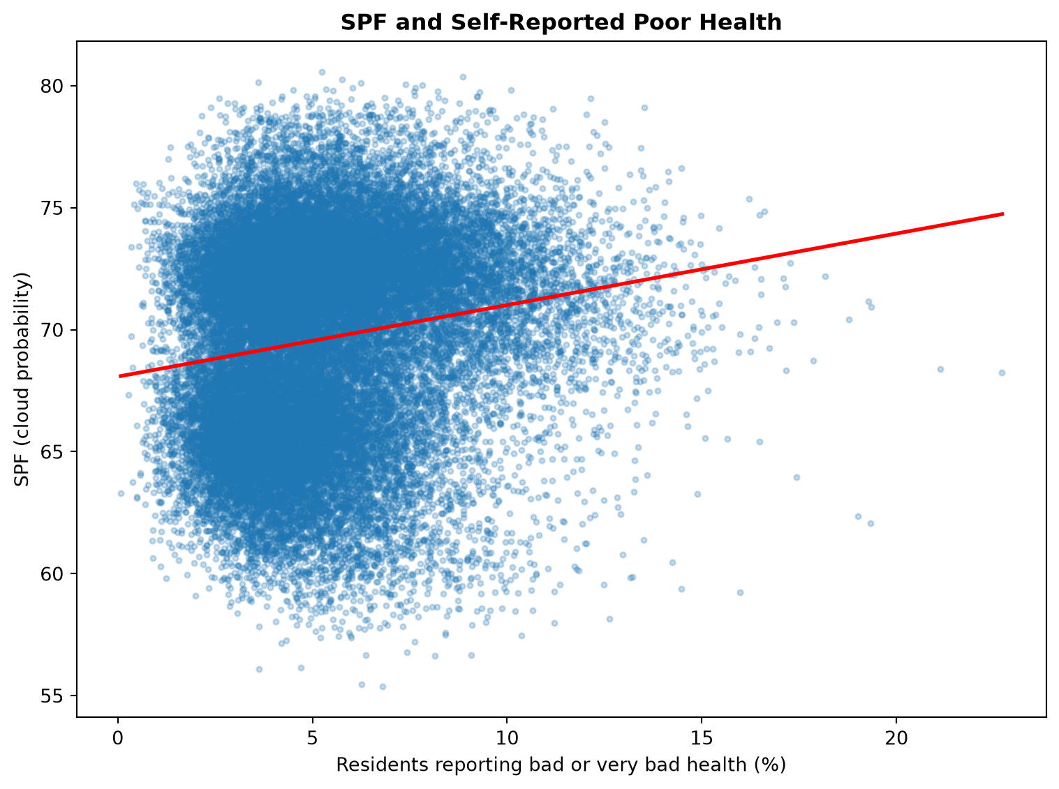
The scatter plot also shows a positive relationship between the proportion of residents reporting bad or very bad health and SPF. LSOAs with higher levels of self-reported poor health tend to have higher SPF values, although the relationship is relatively weak visually and there is substantial variation between individual areas. The density of points also thins out considerably above around 15% poor health, so the regression line’s slope at the higher end of the range is based on comparatively few, more scattered LSOAs than the dense cluster of areas below 10%.
Exploring Fair Health
The previous analysis focused on residents reporting bad or very bad health. However, this represents only the most severe end of the Census health categories.
It is possible that a relationship with environmental conditions would appear earlier in the health distribution — for example, as a shift from good or very good health towards fair health, rather than all the way to bad or very bad health.
Rather than analysing every Census category separately, we therefore use the proportion of residents reporting fair health as a secondary measure, since it sits between the “good” and “bad” categories and is well placed to capture a milder version of the same pattern.
This provides a useful check of whether the relationship observed for poor health also holds for a less severe measure of self-reported health.
fair_correlation, fair_p_value = pearsonr(
    combined["fair_health_percent"],
    combined["cloud_probability"],
)

print(f"Pearson correlation: {fair_correlation:.3f}")
print(f"P-value: {fair_p_value:.3e}")
Pearson correlation: 0.151
P-value: 5.918e-182The correlation between the proportion reporting fair health and SPF is 0.151, compared with 0.164 for bad or very bad health.
This provides a useful comparison with the previous result. The fair-health correlation is also positive and of a similar, weak magnitude — slightly smaller than the correlation observed for bad or very bad health — suggesting the relationship with SPF holds broadly across the health distribution rather than being specific to its most severe end.
Scatterplot
combined = combined.dropna(subset=["fair_health_percent", "cloud_probability"]) # Remove any rows with missing values for the variables of interest

fig, ax = plt.subplots(figsize=(8, 6))

ax.scatter(
    combined["fair_health_percent"],
    combined["cloud_probability"],
    alpha=0.25,
    s=8,
)

# Fit and plot a simple linear regression line
x = combined["fair_health_percent"]
y = combined["cloud_probability"]

slope, intercept = np.polyfit(x, y, 1)
x_line = np.linspace(x.min(), x.max(), 100)

ax.plot(
    x_line,
    slope * x_line + intercept,
    color="red",
    linewidth=2,
)

ax.set_xlabel("Residents reporting fair health (%)")
ax.set_ylabel("SPF (cloud probability)")

ax.set_title(
    "SPF and Self-Reported Fair Health",
    fontweight="bold",
)

plt.tight_layout()
plt.show()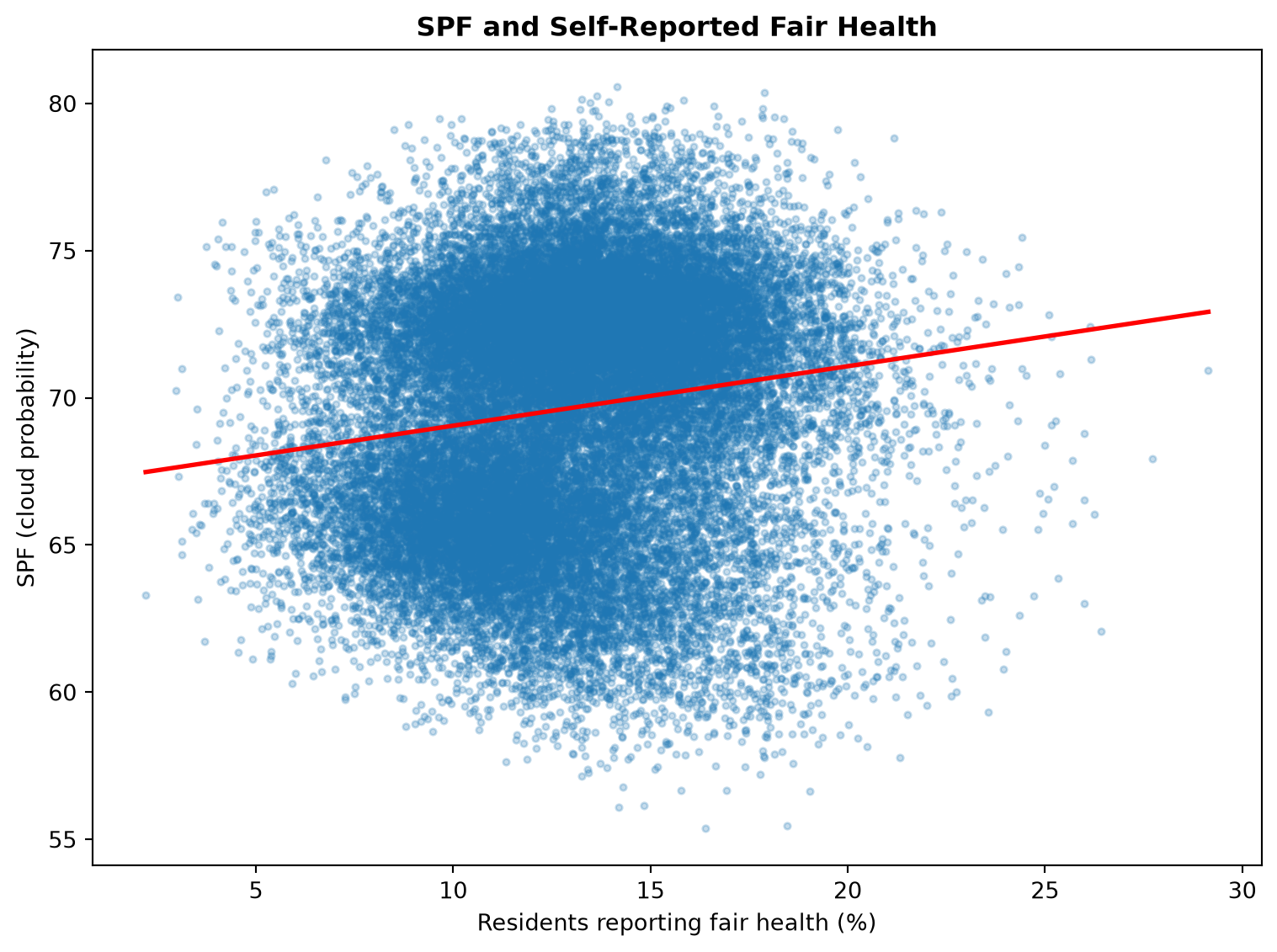
Note
The scatterplot provides a visual check of the correlation. As with poor health, there is substantial variation in SPF among LSOAs at any given level of fair health, meaning that SPF alone does not explain the health differences between communities.
Exploring the Spatial Pattern
The statistical analysis suggests a weak positive relationship between SPF and self-reported poor health. However, a correlation does not tell us whether this relationship is spatially concentrated or whether it is distributed relatively evenly across England and Wales.
To explore this, we identify LSOAs that are in the highest quintile for both SPF and the proportion of residents reporting fair or poor health.
This does not mean that these areas have worse health because of cloudier conditions. Instead, it highlights areas where the two characteristics occur together and allows us to consider whether any clear spatial pattern is visible.
import numpy as np

# Continuous bivariate colour scale via bilinear interpolation between
# four corner colours, using each variable's percentile rank (0-1)
# rather than discrete tercile/quintile bins

def hex_to_rgb(h):
    h = h.lstrip("#")
    return np.array([int(h[i:i+2], 16) for i in (0, 2, 4)]) / 255

# Corners: (low SPF, low health), (high SPF, low health),
#          (low SPF, high health), (high SPF, high health)
c00 = hex_to_rgb("#e8e8e8")  # low, low
c10 = hex_to_rgb("#4393c3")  # high SPF, low health
c01 = hex_to_rgb("#fdb863")  # low SPF, high health
c11 = hex_to_rgb("#5e3c99")  # high, high  (blends toward purple)

combined["spf_pct"] = combined["cloud_probability"].rank(pct=True)
combined["health_pct"] = combined["poor_health_percent"].rank(pct=True)

def bilinear_color(x, y):
    top = c00 * (1 - x) + c10 * x
    bottom = c01 * (1 - x) + c11 * x
    rgb = top * (1 - y) + bottom * y
    return tuple(rgb)

combined["bivariate_color"] = combined.apply(
    lambda row: bilinear_color(row["spf_pct"], row["health_pct"]), axis=1
)

fig, ax = plt.subplots(figsize=(10, 10))

combined.plot(
    color=combined["bivariate_color"],
    ax=ax,
)

ax.axis("off")
ax.set_title(
    "SPF and Poor Health: A Bivariate View",
    fontweight="bold",
)

# Continuous legend: render as a small image, not a discrete grid
legend_ax = fig.add_axes([0.15, 0.15, 0.12, 0.12])
n = 100
legend_img = np.zeros((n, n, 3))
for i in range(n):
    for j in range(n):
        legend_img[n - 1 - i, j] = bilinear_color(j / (n - 1), i / (n - 1))

legend_ax.imshow(legend_img, origin="lower", extent=[0, 1, 0, 1])
legend_ax.set_xlabel("Poor health →", fontsize=8)
legend_ax.set_ylabel("Sunnier → Cloudier", fontsize=8)
legend_ax.set_xticks([])
legend_ax.set_yticks([])

plt.show()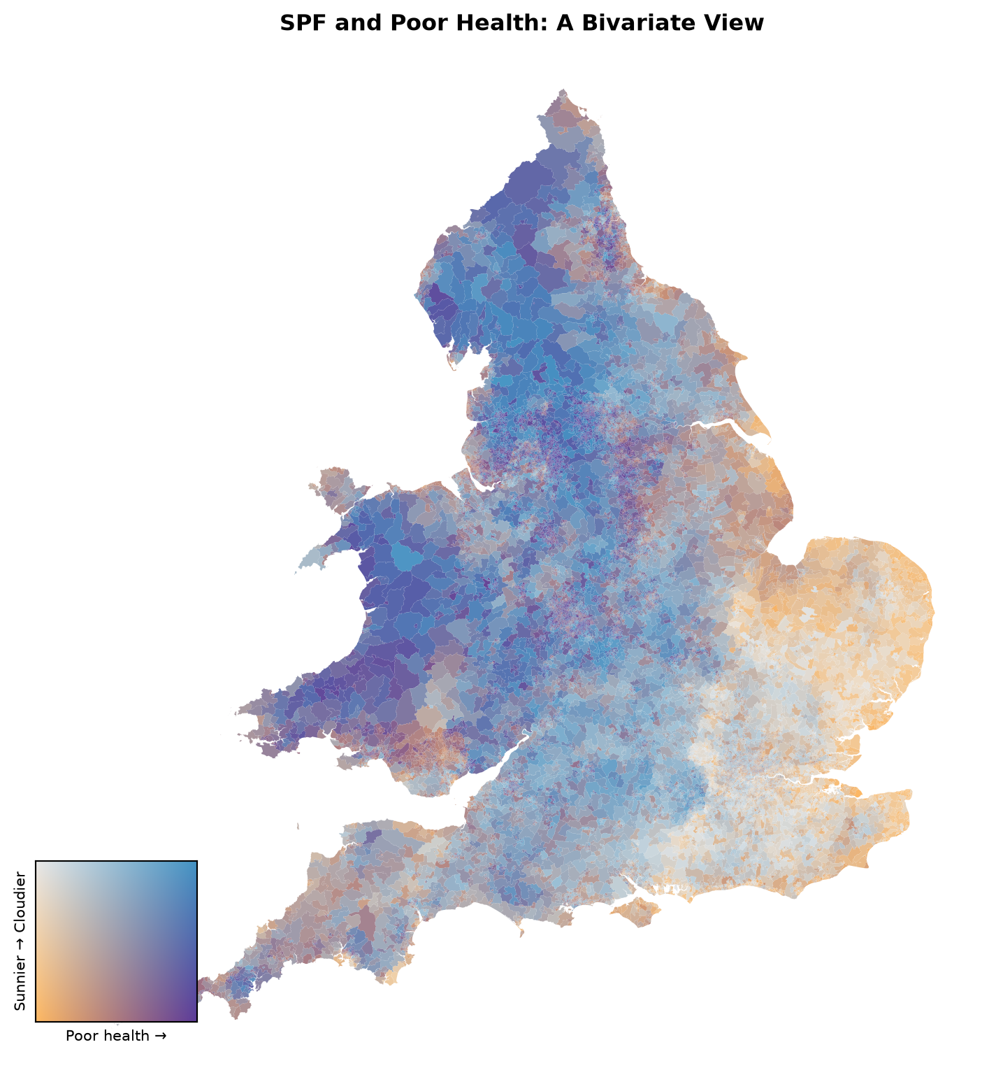
NoteA note on interpreting this map
The dominant pattern on this map runs counter to the weak positive relationship observed nationally. A broad belt of blue-purple tones extends from North West England down through Wales, combining high SPF (cloudier conditions) with comparatively low levels of poor health. Across most of the South East and East of England, the opposite combination dominates: low SPF (clearer skies) paired with comparatively high poor health.
The one region where SPF and poor health align in the direction suggested by the national correlation is Wales, particularly the central and southern parts, where the map’s darkest purple tones mark LSOAs combining both high SPF and high poor health simultaneously — consistent with the earlier LSOA-level health map, which also identified South Wales as a distinct poor-health cluster.
This is a useful illustration of why a weak aggregate correlation should not be read as a consistent local relationship. Other factors that vary regionally — such as deprivation, urban form, age structure, or access to healthcare — are likely to have a far stronger influence on self-reported health than SPF, and may dominate or even reverse the national pattern within particular regions.
What Have We Learnt?
In this notebook we have:
- combined the 2025 Sun Probability Framework (SPF) data with Census 2021 general health data
- calculated the proportion of residents reporting bad or very bad, and fair, health for each LSOA
- examined the spatial distribution of SPF and self-reported poor health across England and Wales
- compared SPF across groups with different levels of poor health
- calculated the correlation between SPF and poor/fair health
- visualised the relationships using scatterplots
- identified areas where high SPF and high levels of poor/fair health occur together, using a bivariate map
The analysis suggests a weak positive association between SPF and self-reported poor health at the national level, but the bivariate map shows this relationship is far from consistent across the country — running in the opposite direction across much of North West England and Wales, and only aligning with the national pattern in parts of Wales. This relationship should not be interpreted as evidence that cloud cover or sunlight conditions directly affect population health.
The analysis is conducted at the LSOA level, meaning that it describes spatial patterns between communities rather than relationships between individuals. This is particularly important when interpreting health data, as an association between areas does not imply that individuals experiencing poorer health necessarily experience different sunlight conditions.