# Core data handling and plotting
library(tidyverse)   # Data manipulation + ggplot2

# Spatial data and mapping
library(sf)          # Simple Features

# Plot composition
library(cowplot)     # Combine main map with inset legend

# Animation
library(gifski)      # GIF encoder for save_gif()

# Python interop (only needed if rendering both languages)
library(reticulate)Air temperature - Bivariate maps
Goal: Visualise the joint geography of heat exposure and deprivation. Where in England do high summer temperatures and high health deprivation overlap?
Installing packages
This part is mostly cartography.
# Data & geospatial
import numpy as np
import pandas as pd
import geopandas as gpd

# Plotting
import matplotlib.pyplot as plt
from mpl_toolkits.axes_grid1.inset_locator import inset_axes
from matplotlib.colors import to_rgb
Load the data
We need three things: the 2024 temperature geopackage (for geometry + summer maximum temperature), the MSOA-level IMD aggregate written by Part 1, and a clean inner join of the two with no missing values.
# 1. Temperature + geometry from the 2024 file
msoa_temp <- read_sf("./data/temperature_indicators_MSOA_2024.gpkg") %>%
  mutate(msoa21cd = trimws(as.character(dt_zn_c)))

# 2. MSOA-level health rank (built in Part 1)
msoa_imd_agg <- read_csv("./data/derived/msoa_imd_agg.csv")

# 3. Inner join, drop incomplete rows
msoa_final_clean <- msoa_temp %>%
  inner_join(
    msoa_imd_agg %>% select(msoa21cd, msoa21nm, ladcd, health_rank_msoa),
    by = "msoa21cd"
  ) %>%
  drop_na(summer_max_tmp, health_rank_msoa)

glimpse(msoa_final_clean %>% st_drop_geometry())
Rows: 6,855
Columns: 20
$ dt_zn_c <chr> "E02000001", "E02000002", "E02000003", "E0200000…
$ dt_zn_n <chr> "City of London 001", "Barking and Dagenham 001"…
$ annual_mean_tmp <dbl> 12.76346, 12.07690, 12.20336, 12.33897, 12.34112…
$ annual_max_tmp <dbl> 16.28021, 15.99580, 16.07938, 16.19617, 16.16838…
$ annual_min_tmp <dbl> 9.247190, 8.215314, 8.376277, 8.529167, 8.552910…
$ winter_mean_tmp <dbl> 7.962327, 7.301272, 7.425026, 7.562093, 7.556808…
$ spring_mean_tmp <dbl> 12.23706, 11.55152, 11.67148, 11.78149, 11.80289…
$ summer_mean_tmp <dbl> 18.24644, 17.54276, 17.68478, 17.84687, 17.84362…
$ autumn_mean_tmp <dbl> 12.78338, 12.08531, 12.20684, 12.34222, 12.33728…
$ summer_max_tmp <dbl> 23.00629, 22.75395, 22.83498, 22.96780, 22.92410…
$ winter_min_tmp <dbl> 5.307874, 4.413336, 4.557454, 4.709777, 4.712059…
$ temporal_sd_tmp <dbl> 4.218369, 4.201226, 4.209268, 4.221317, 4.220945…
$ tmp_anomaly_absolute <dbl> 2.558206, 2.472255, 2.478608, 2.477158, 2.483515…
$ tmp_anomaly_relative <dbl> 3.939247, 4.046119, 4.044049, 4.074961, 4.043092…
$ extreme_hot_days_mean <dbl> 3.000000, 3.000000, 3.000000, 3.000000, 3.000000…
$ hot_spell_3day_mean <dbl> 7.000000, 7.000000, 7.008710, 8.000000, 7.675590…
$ msoa21cd <chr> "E02000001", "E02000002", "E02000003", "E0200000…
$ msoa21nm <chr> "City of London 001", "Barking and Dagenham 001"…
$ ladcd <chr> "E09000001", "E09000002", "E09000002", "E0900000…
$ health_rank_msoa <dbl> 22028.83, 11095.00, 18487.00, 16948.25, 14276.17…# 1. Temperature + geometry from the 2024 file
msoa_temp = gpd.read_file("./data/temperature_indicators_MSOA_2024.gpkg")
msoa_temp["msoa21cd"] = msoa_temp["dt_zn_c"].astype(str).str.strip()
# 2. MSOA-level health rank (built in Part 1)
msoa_imd_agg = pd.read_csv("./data/derived/msoa_imd_agg.csv")
# 3. Inner join, drop incomplete rows
msoa_final_clean = (
msoa_temp
.merge(
msoa_imd_agg[["msoa21cd", "msoa21nm", "ladcd", "health_rank_msoa"]],
how="inner", on="msoa21cd"
)
.dropna(subset=["summer_max_tmp", "health_rank_msoa"])
.reset_index(drop=True)
)
msoa_final_clean.info()<class 'geopandas.geodataframe.GeoDataFrame'>
RangeIndex: 6855 entries, 0 to 6854
Data columns (total 21 columns):
# Column Non-Null Count Dtype
--- ------ -------------- -----
0 dt_zn_c 6855 non-null str
1 dt_zn_n 6855 non-null str
2 annual_mean_tmp 6855 non-null float64
3 annual_max_tmp 6855 non-null float64
4 annual_min_tmp 6855 non-null float64
5 winter_mean_tmp 6855 non-null float64
6 spring_mean_tmp 6855 non-null float64
7 summer_mean_tmp 6855 non-null float64
8 autumn_mean_tmp 6855 non-null float64
9 summer_max_tmp 6855 non-null float64
10 winter_min_tmp 6855 non-null float64
11 temporal_sd_tmp 6855 non-null float64
12 tmp_anomaly_absolute 6855 non-null float64
13 tmp_anomaly_relative 6855 non-null float64
14 extreme_hot_days_mean 6855 non-null float64
15 hot_spell_3day_mean 6855 non-null float64
16 geometry 6855 non-null geometry
17 msoa21cd 6855 non-null str
18 msoa21nm 6855 non-null str
19 ladcd 6855 non-null str
20 health_rank_msoa 6855 non-null float64
dtypes: float64(15), geometry(1), str(5)
memory usage: 1.1 MBBivariate choropleth
A bivariate map shows two variables at once by combining their colour scales into a 3×3 grid. We split MSOAs into terciles on each variable: low/medium/high summer maximum temperature, and low/medium/high health deprivation. Each MSOA falls into one of nine bins, and each bin gets its own colour.
The interesting cells are the corners. The dark-red 3-3 corner is hot and deprived — the climate-justice cell. The pale 1-1 corner is cool and affluent. The off-diagonal corners (3-1 hot but affluent, 1-3 cool but deprived) are England’s geography in microcosm.
Build the bivariate classes and palette
msoa_bi <- msoa_final_clean %>%
  mutate(
    summer_class = ntile(summer_max_tmp, 3),         # 1 = low temp, 3 = high
    health_class = ntile(-health_rank_msoa, 3),      # -rank so 3 = most deprived
    bi_class     = paste0(summer_class, "-", health_class)
  )

bi_palette <- c(
  "1-1" = "#D9EBF5",  # low heat, low deprivation
  "2-1" = "#E8E0D5",  # medium heat, low deprivation
  "3-1" = "#F5B895",  # high heat, low deprivation
  "1-2" = "#ACD4E8",  # low heat, medium deprivation
  "2-2" = "#D5D5D5",  # medium heat, medium deprivation
  "3-2" = "#E67676",  # high heat, medium deprivation
  "1-3" = "#6A9ABD",  # low heat, high deprivation
  "2-3" = "#C99191",  # medium heat, high deprivation
  "3-3" = "#C83737"   # high heat, high deprivation
)
msoa_bi = msoa_final_clean.copy()
msoa_bi["summer_class"] = pd.qcut(
msoa_bi["summer_max_tmp"], q=3, labels=[1, 2, 3]
)
msoa_bi["health_class"] = pd.qcut(
msoa_bi["health_rank_msoa"], q=3, labels=[3, 2, 1] # reversed
)
msoa_bi["bi_class"] = (
msoa_bi["summer_class"].astype(str) + "-" + msoa_bi["health_class"].astype(str)
)
bi_palette = {
"1-1": "#D9EBF5",
"2-1": "#E8E0D5",
"3-1": "#F5B895",
"1-2": "#ACD4E8",
"2-2": "#D5D5D5",
"3-2": "#E67676",
"1-3": "#6A9ABD",
"2-3": "#C99191",
"3-3": "#C83737",
}
msoa_bi["color"] = msoa_bi["bi_class"].map(bi_palette)Draw the map
p_map <- ggplot(msoa_bi) +
  geom_sf(aes(fill = bi_class), colour = NA) +
  scale_fill_manual(values = bi_palette) +
  labs(
    title = "Bivariate map: summer temperature and health deprivation",
    caption = "Sources: Imago temperature indicators, 2024; English IMD 2025."
  ) +
  theme_void() +
  theme(
    legend.position = "none",
    plot.title      = element_text(face = "bold")
  )

# 3x3 inset legend
legend_df <- expand_grid(summer_class = 1:3, health_class = 1:3) %>%
  mutate(
    bi_class = paste0(summer_class, "-", health_class),
    fill     = bi_palette[bi_class]
  )

p_legend <- ggplot(legend_df, aes(x = summer_class, y = health_class, fill = fill)) +
  geom_tile() +
  scale_fill_identity() +
  coord_equal() +
  labs(x = "Summer temp →", y = "Deprivation →") +
  theme_void() +
  theme(
    panel.border = element_rect(colour = "black", fill = NA),
    axis.title.x = element_text(size = 8, hjust = 0.5, margin = margin(t = 4)),
    axis.title.y = element_text(size = 8, hjust = 0.5, angle = 90, margin = margin(r = 4))
  )

ggdraw() +
  draw_plot(p_map) +
  draw_plot(p_legend, x = 0.85, y = 0.05, width = 0.12, height = 0.12)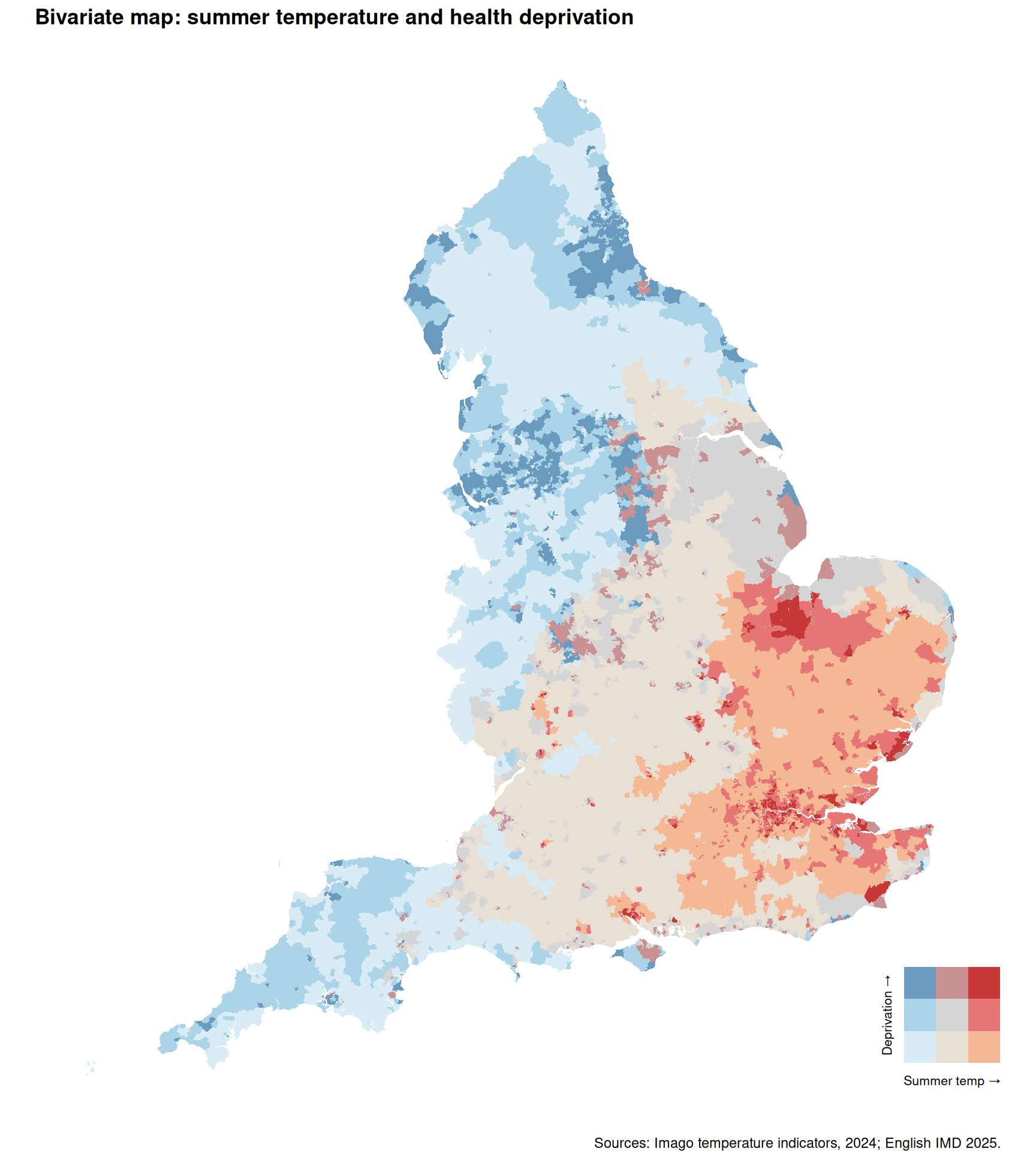
fig, ax = plt.subplots(figsize=(10, 10))

msoa_bi.plot(ax=ax, color=msoa_bi["color"], edgecolor="none")
ax.set_title("Bivariate map: summer temperature and health deprivation",
             fontweight="bold", fontsize=13)
ax.set_axis_off()

# Inset legend (3x3 grid)
ax_legend = inset_axes(ax, width="15%", height="15%",
                       loc="lower right", borderpad=2)

legend_grid = np.zeros((3, 3), dtype=object)
for i, health in enumerate([3, 2, 1]):       # y-axis: top = most deprived
    for j, summer in enumerate([1, 2, 3]):   # x-axis: left = low temp
        legend_grid[i, j] = bi_palette[f"{summer}-{health}"]

rgb_grid = np.array([[to_rgb(c) for c in row] for row in legend_grid])

ax_legend.imshow(rgb_grid, origin="upper")
ax_legend.set_xticks([0, 1, 2])
ax_legend.set_yticks([0, 1, 2])
ax_legend.set_xticklabels(["Low", "", "High"], fontsize=8)
ax_legend.set_yticklabels(["High", "", "Low"], fontsize=8)
ax_legend.set_xlabel("Summer temp →", fontsize=8)
ax_legend.set_ylabel("← Deprivation",  fontsize=8)
ax_legend.tick_params(length=0)

plt.figtext(0.5, 0.04,
            "Sources: Imago temperature indicators, 2024; English IMD 2025.",
            ha="center", fontsize=9, color="grey")
plt.tight_layout()
<string>:1: UserWarning: This figure includes Axes that are not compatible with tight_layout, so results might be incorrect.plt.show()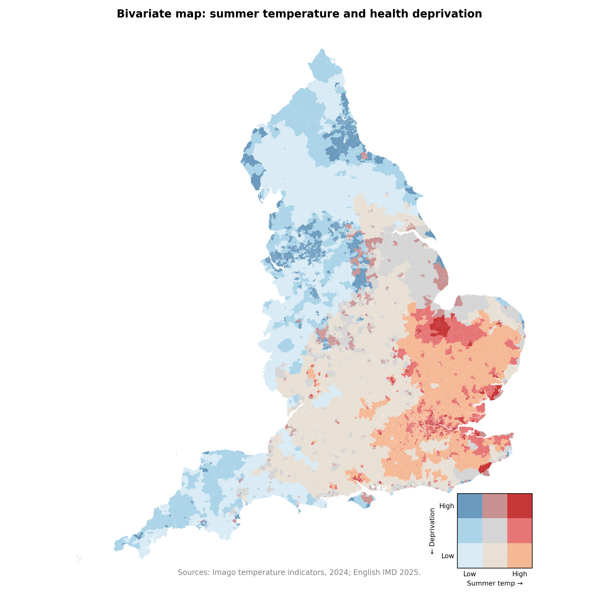
NoteReading the map
The dark-red 3-3 cells — hot and deprived — cluster in pockets within the south-east, particularly around outer London and the Thames Estuary. The blue 1-3 cells — cool and deprived — dominate post-industrial parts of the north and midlands. The pale 1-1 corner (cool, affluent) covers most of rural northern and western England, and the orange 3-1 corner (hot, affluent) sits across much of the affluent south. The map makes visible something the regression in Part 1 obscured: the climate-justice cell exists, but it is small and geographically specific rather than a national pattern.
Animated hotspot zoom
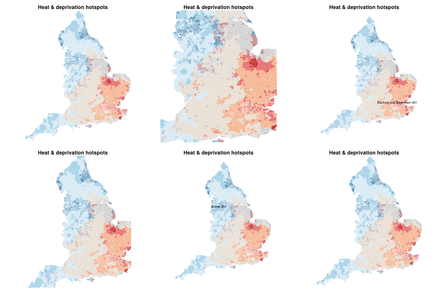
Bivariate maps at national scale show structure but flatten the local detail. An animation that zooms from the national view into a Greater London 3-3 hotspot, holds, then zooms back out and into a 1-1 cool-affluent area for contrast, gives an audience a feel for both ends of the distribution.
We use gifski::save_gif() directly with ggplot frames. Each frame re-uses the same MSOA polygons but changes the coord_sf() viewport, producing a smooth zoom. The block writes hotspot_animation_lite.gif to the working directory.
Note
The animation is R-only. Looping matplotlib figures into a gif from Python (imageio.mimsave or pillow) is more code for less polish, so we leave it out of the Python tab here.
# 1. Pick the hotspots
# A 3-3 (hot + deprived) MSOA in Greater London (LAD codes start with E09)
london_hotspot <- msoa_bi %>%
  filter(bi_class == "3-3", grepl("^E09", ladcd)) %>%
  slice(1)

# Fallback: any 3-3 nationally if no London match
if (nrow(london_hotspot) == 0) {
  london_hotspot <- msoa_bi %>% filter(bi_class == "3-3") %>% slice(1)
}

# A 1-1 (cool + affluent) MSOA for contrast
low_hotspot <- msoa_bi %>%
  filter(bi_class == "1-1") %>%
  slice(1)
if (nrow(low_hotspot) == 0) low_hotspot <- msoa_bi %>% slice(n())

# 2. Define zoom extents (national bbox + buffered hotspot bboxes)
full_bbox <- st_bbox(msoa_bi)
hot_bbox  <- st_bbox(st_buffer(london_hotspot, 5000))
low_bbox  <- st_bbox(st_buffer(low_hotspot,    5000))

# Helper: linearly interpolate between two bounding boxes
interpolate_bbox <- function(b1, b2, n) {
  lapply(seq(0, 1, length.out = n), function(a) {
    res <- (1 - a) * b1 + a * b2
    class(res) <- class(b1)
    attributes(res)$crs <- attributes(b1)$crs
    res
  })
}

# Build the bbox sequence: intro → zoom in hot → stay → zoom out → zoom in low → stay → return
bboxes <- c(
  replicate(5,  list(full_bbox)),
  interpolate_bbox(full_bbox, hot_bbox, 10),
  replicate(10, list(hot_bbox)),
  interpolate_bbox(hot_bbox, full_bbox, 10),
  interpolate_bbox(full_bbox, low_bbox, 10),
  replicate(10, list(low_bbox)),
  interpolate_bbox(low_bbox, full_bbox, 10)
)

# 3. Frame builder — one ggplot per bbox, with optional hotspot outline + label
make_frame <- function(i) {
  bb <- bboxes[[i]]

  p <- ggplot(msoa_bi) +
    geom_sf(aes(fill = bi_class), colour = "white", linewidth = 0.05) +
    scale_fill_manual(values = bi_palette, guide = "none") +
    coord_sf(
      xlim   = c(bb["xmin"], bb["xmax"]),
      ylim   = c(bb["ymin"], bb["ymax"]),
      expand = FALSE
    ) +
    labs(title = "Heat & deprivation hotspots") +
    theme_void(base_size = 11) +
    theme(
      plot.title    = element_text(face = "bold", hjust = 0.5),
      plot.margin   = margin(8, 8, 8, 8),
      panel.background = element_rect(fill = "white", colour = NA),
      plot.background  = element_rect(fill = "white", colour = NA)
    )

  # Outline + label the hot hotspot while zoomed in on it
  if (nrow(london_hotspot) > 0 && i > 10 && i < 35) {
    p <- p +
      geom_sf(data = london_hotspot, fill = NA, colour = "black", linewidth = 0.7) +
      geom_sf_text(data = london_hotspot, aes(label = msoa21nm),
                   size = 3, colour = "black",
                   bg.colour = "white", bg.r = 0.15)
  }
  # And similarly for the cool hotspot
  if (nrow(low_hotspot) > 0 && i > 40 && i < 65) {
    p <- p +
      geom_sf(data = low_hotspot, fill = NA, colour = "black", linewidth = 0.7) +
      geom_sf_text(data = low_hotspot, aes(label = msoa21nm),
                   size = 3, colour = "black",
                   bg.colour = "white", bg.r = 0.15)
  }
  print(p)
}

# 4. Encode the gif. save_gif() opens its own PNG device, so each frame
#    is guaranteed to be the same size — no gifski_finish surprises.
gifski::save_gif(
  for (i in seq_along(bboxes)) make_frame(i),
  gif_file = "hotspot_animation_lite.gif",
  width    = 500,
  height   = 500,
  delay    = 0.15,    # seconds per frame
  res      = 96
)
TipIf the animation still fails
A few quick things to check:
geom_sf_text(bg.colour = ...)requiresggplot2 ≥ 3.5.0. On older versions, dropbg.colourandbg.r— labels will appear without the white halo.- The chunk writes the gif to
hotspot_animation_lite.gifin your project root. If Quarto can’t find the file when rendering, setknitr::opts_chunk$set(fig.path = ".")or write to a path you reference in the![...]()line. - The animation has ~65 frames; if rendering is slow, drop the
replicate()andinterpolate_bbox()counts (e.g.replicate(3, ...),interpolate_bbox(..., 6)) for a quicker preview.